Case Study
IoT Notification System
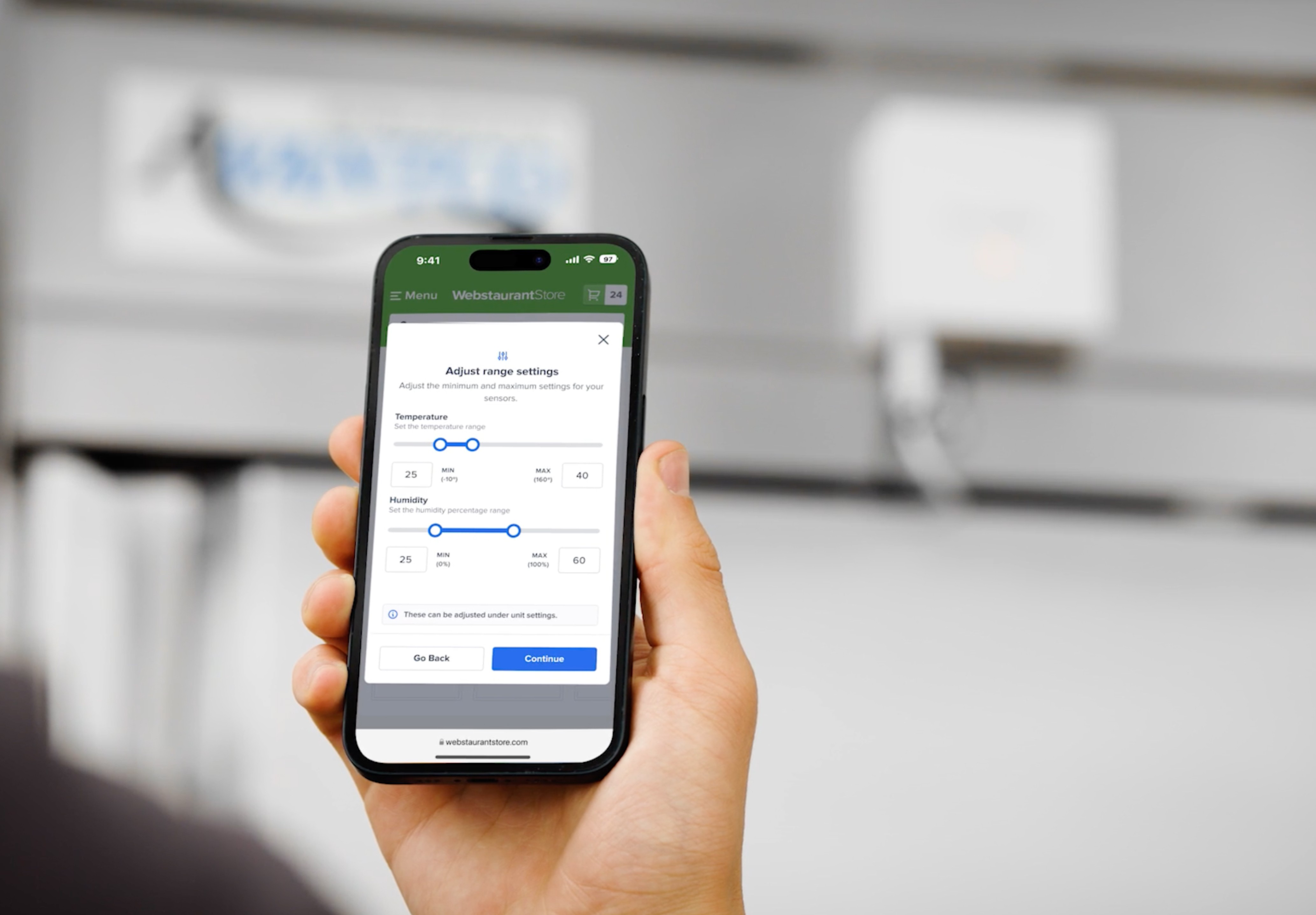
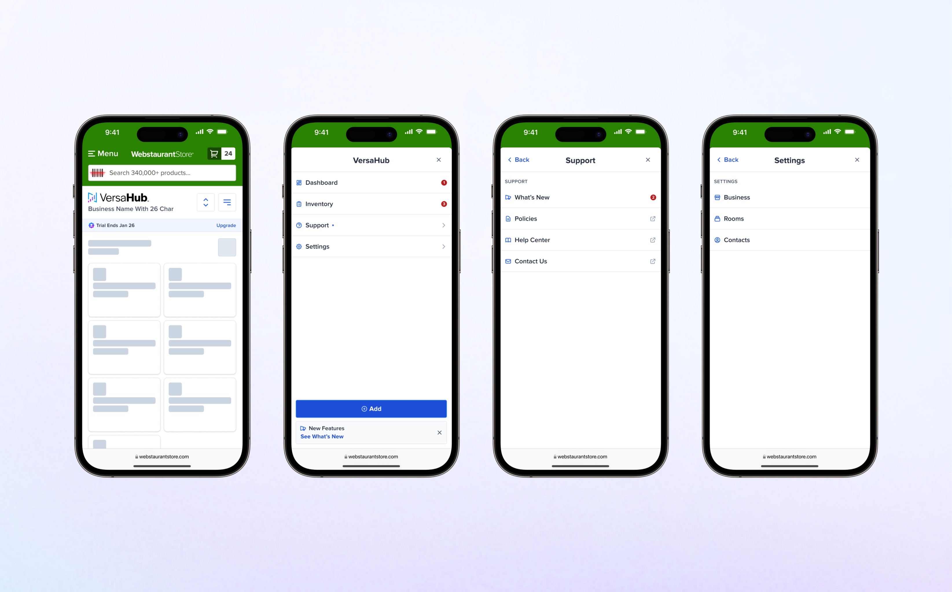
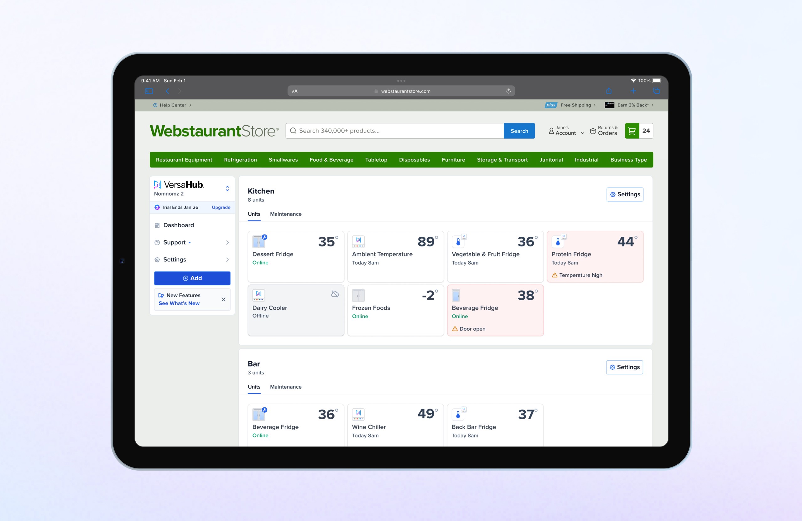
Design a modular, scalable notification system to enhance email and SMS communications, boosting user engagement, retention while reducing support queries.
Before
After
Project Overview
Status
Shipped
Contribution
Director of Product Design
Year
2021–2024
Product
Web Design, UX/UI Design, Branding
Audience
Lead Product Designer
Skills
UX Design & Strategy
Product Strategy
User Research
Prototyping & Testing
Design System
Content Design
Problem Statement
Results & Impact
Goals
The primary goal of this project was to redesign VersaHub’s outdated email system to enhance user comprehension and improve the onboarding experience. The initiative focused on creating a scalable framework while addressing specific business objectives:
Improve user onboarding: Enhance communication clarity to better guide users through the platform setup.
Enable scalability: Design a modular system that supports various notification types and reduces development time.
Drive engagement: Increase equipment registration rates and encourage users to upgrade to premium membership plans.
Empower users: Replace ambiguous messaging with actionable data points to help users make informed decisions.
Reduce support interactions: Provide clear, concise information to minimize contact center queries and improve user self-sufficiency.
Discovery
Define
Design Process
Research
Conducted a comprehensive audit of the existing notification system, identifying key issues with branding, accessibility, and usability.
Analyzed best practices for email design, exploring the use of emojis to add value without diluting professionalism. After careful evaluation, emojis were included selectively where they enhanced clarity and relevance.
Collaborated across Product, Engineering, and R&D teams to document all existing and future notification types, ensuring the framework could accommodate diverse requirements.
Framework Development
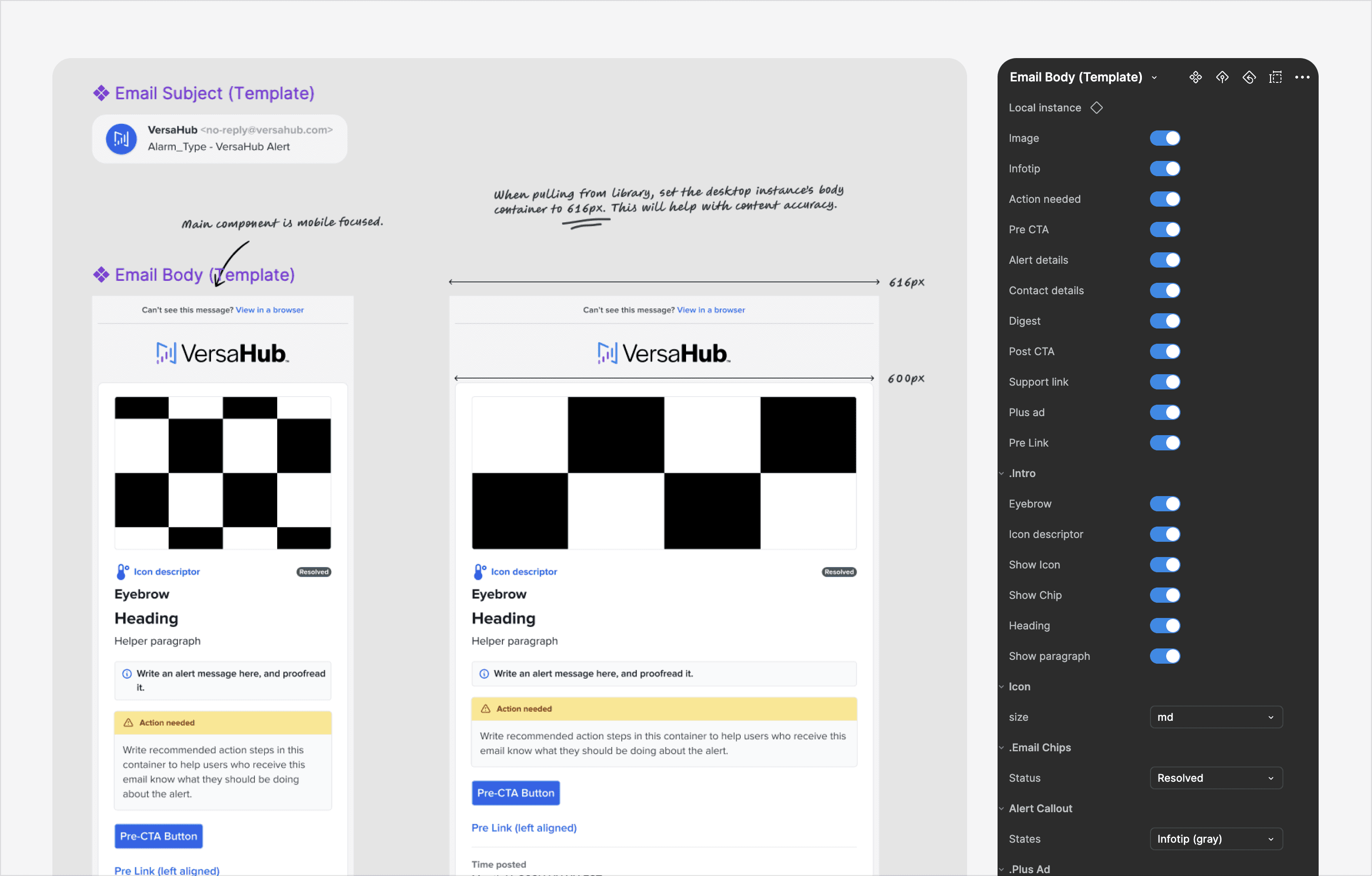
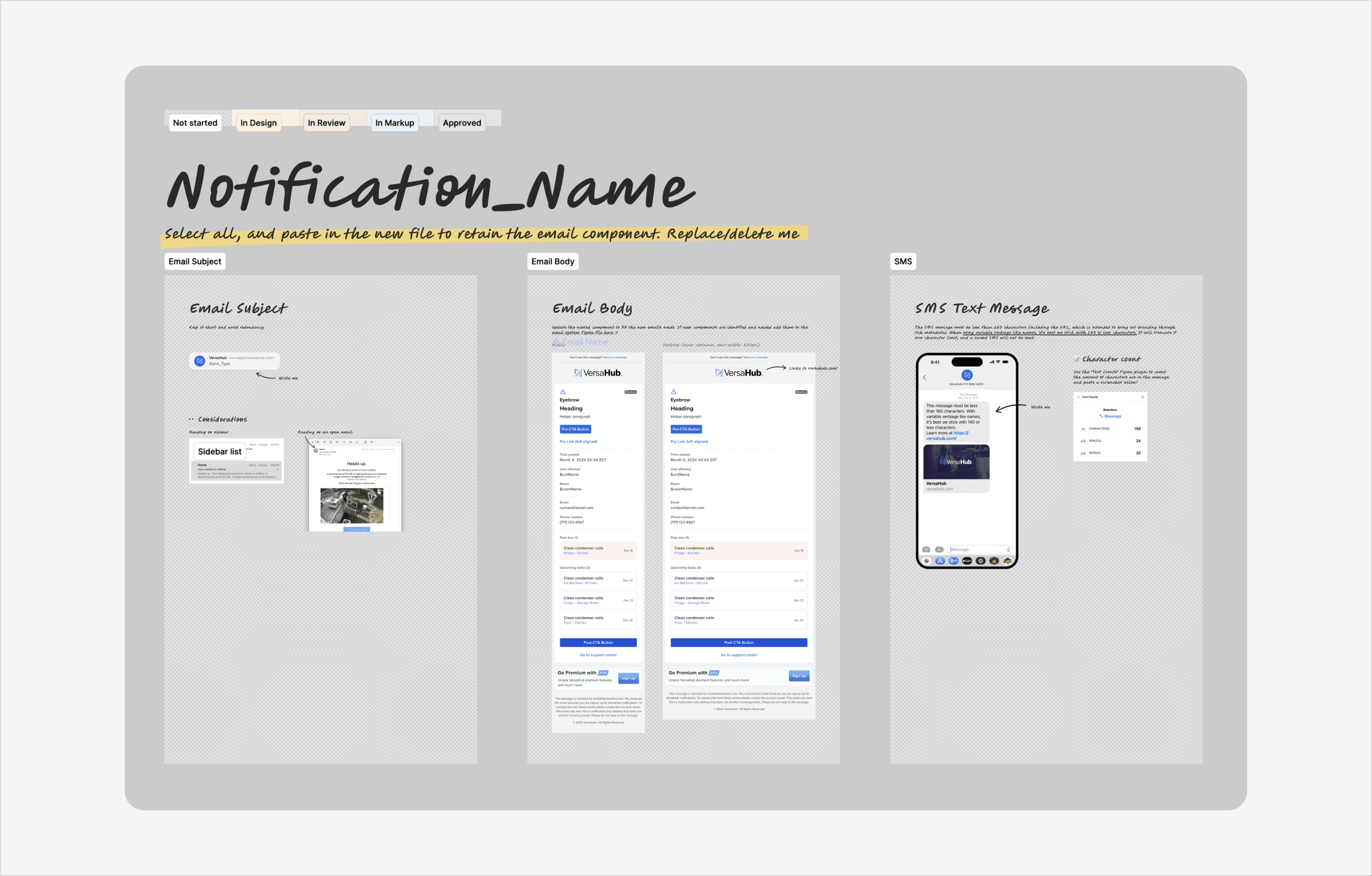
Designed modular components in Figma with a mobile-first approach, ensuring updates to mobile designs automatically reflected in desktop variants for efficiency. Structured components hierarchically, marking individual elements as unpublished while only the final template molecule was made library-ready.
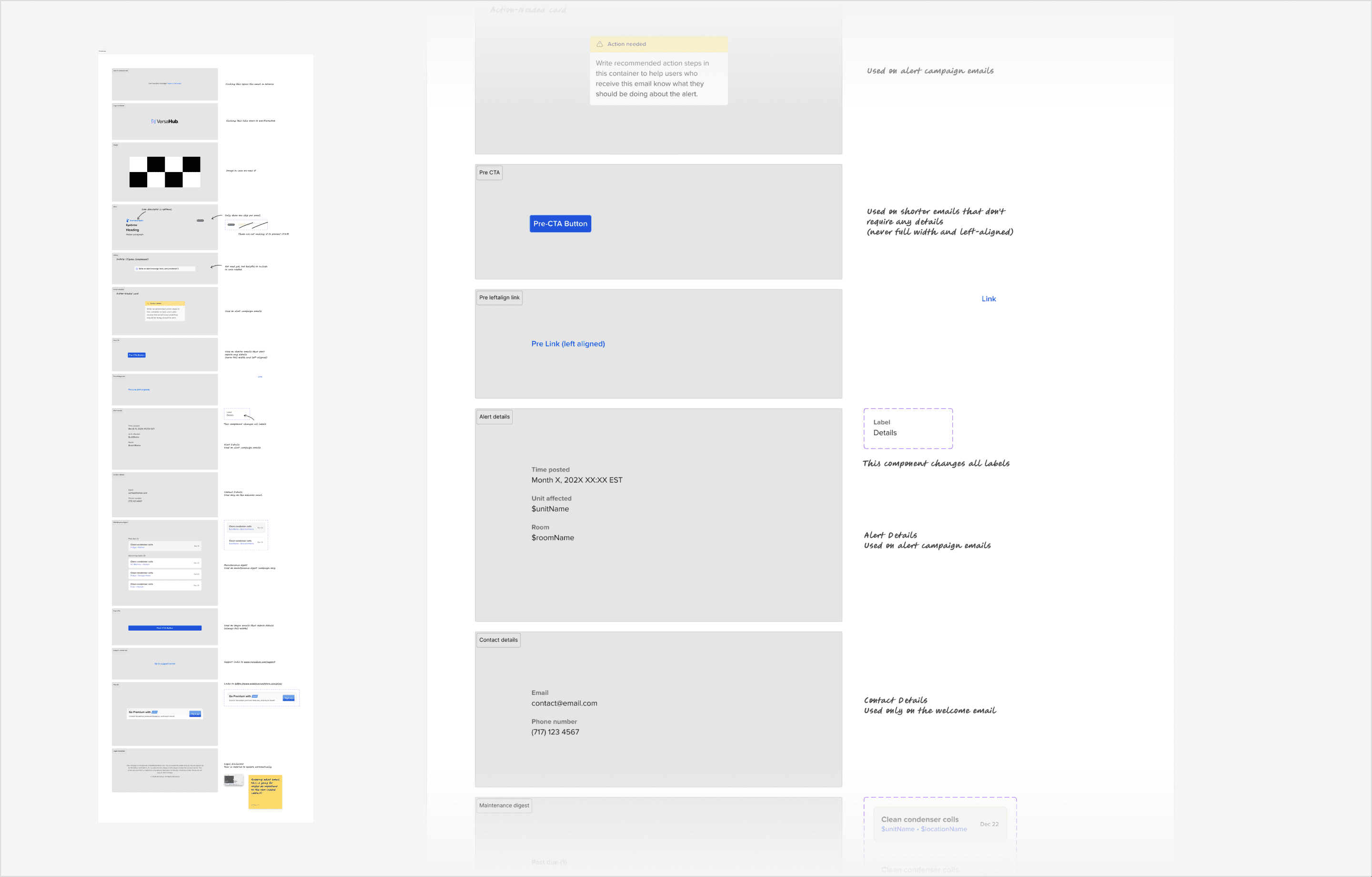
Published a reusable library of templates organized into Alerts, Onboarding, and Digests, enabling consistent messaging across all campaigns.
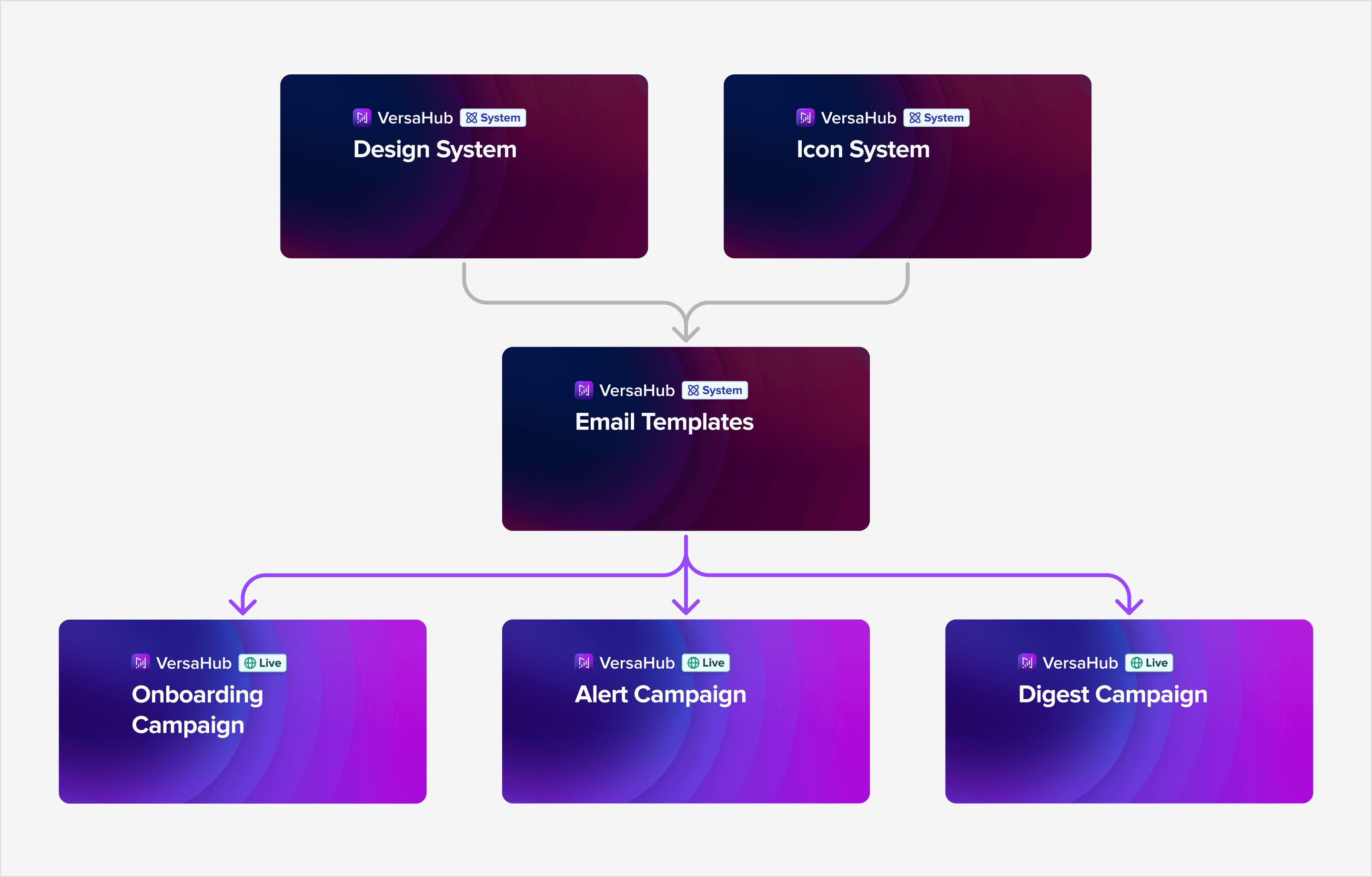
Integrated dynamic properties, such as boolean toggles and select options, to allow for quick customization and streamlined content generation.
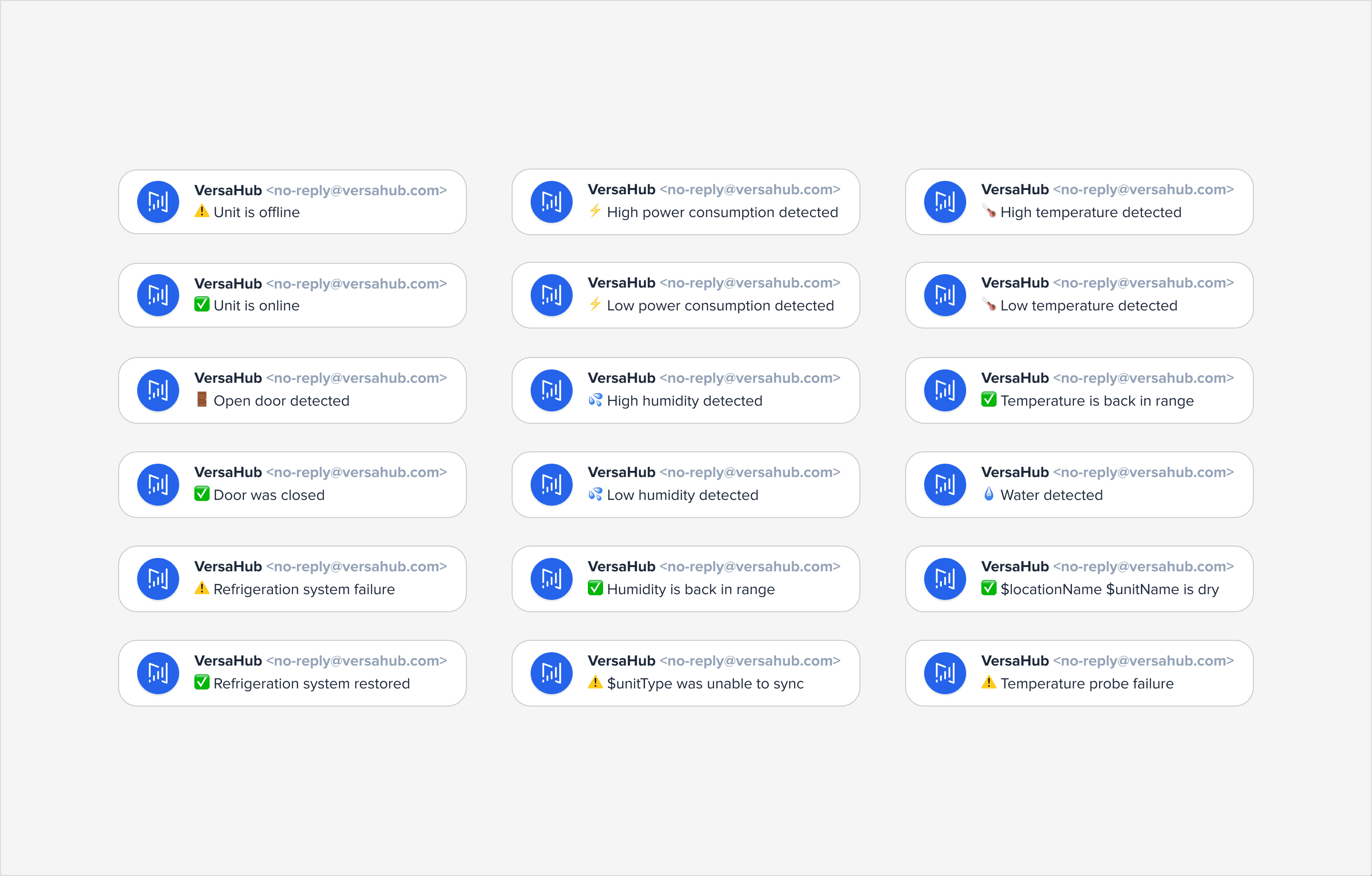
Ensured subject lines were consistent and delivered value when possible.
Wireframes and Prototypes
Created individual components for each notification type, leveraging existing design systems where applicable and introducing unique designs for specialized use cases.
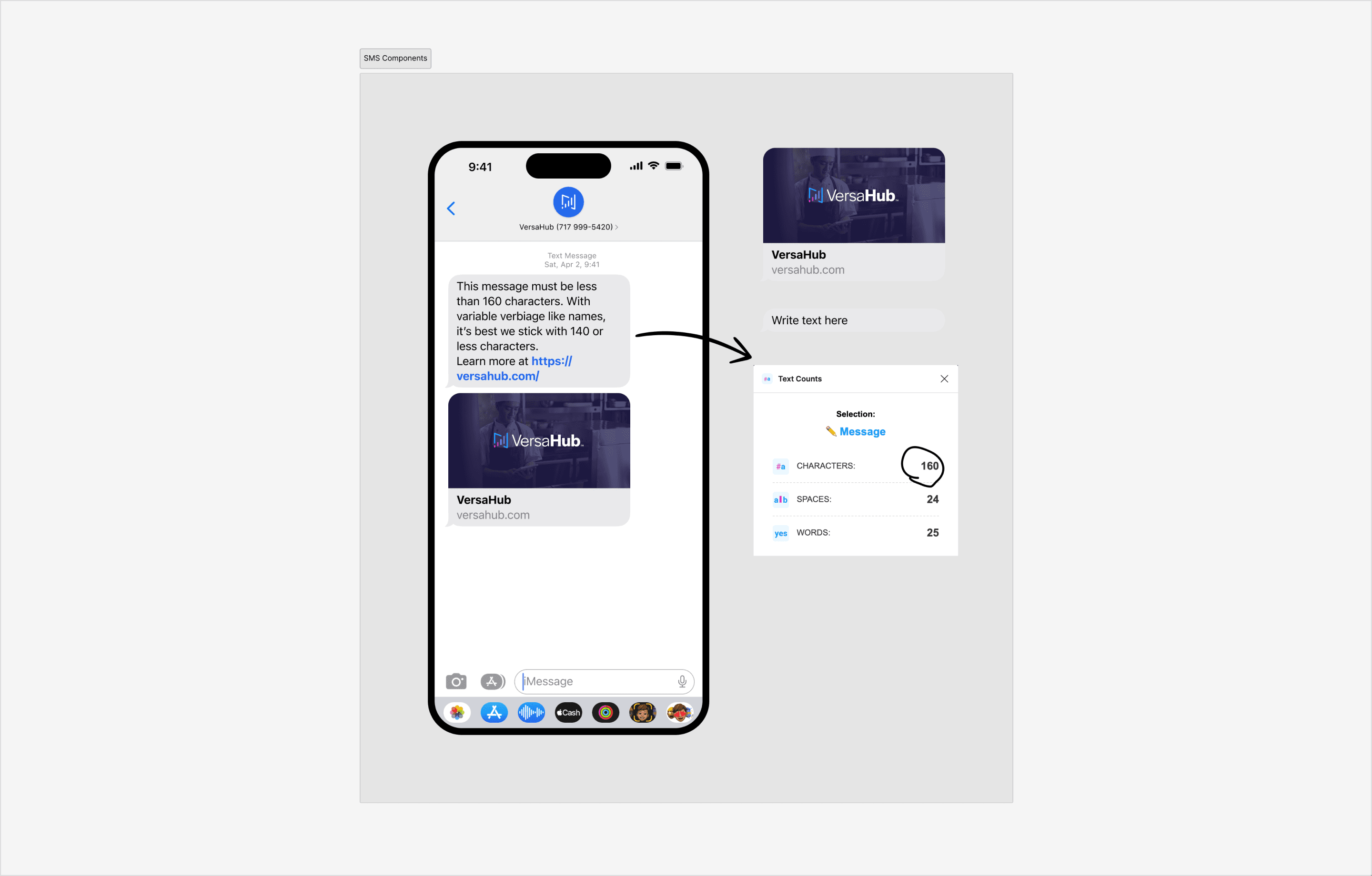
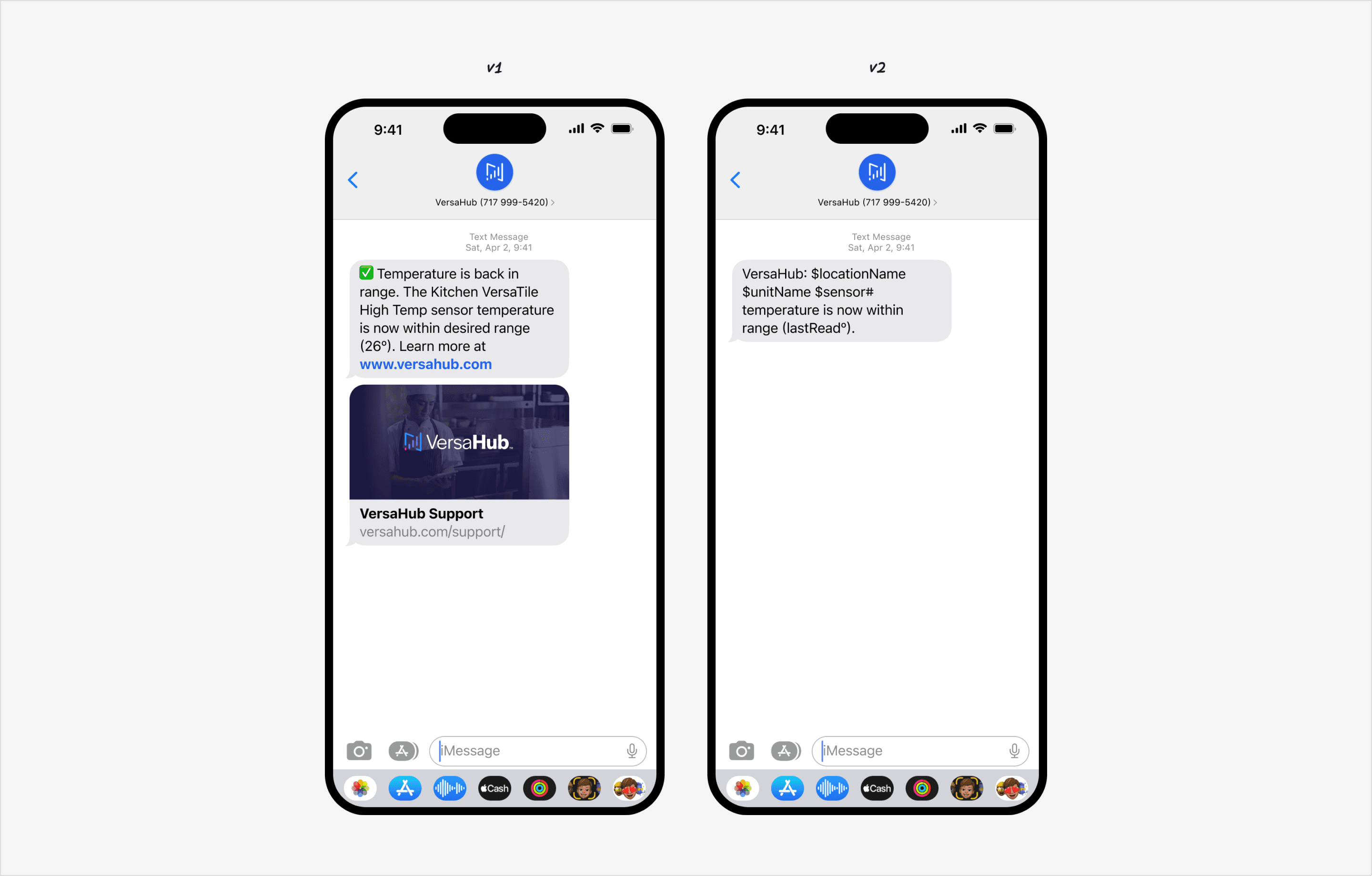
Leveraged Figma plugins like “Text Counts” to validate SMS character limits and accommodate variable data such as equipment names and locations within the 160-character constraint.
Stitched components into a root template, which served as the master framework for notifications. This ensured flexibility while maintaining structural integrity.
Content Formulas
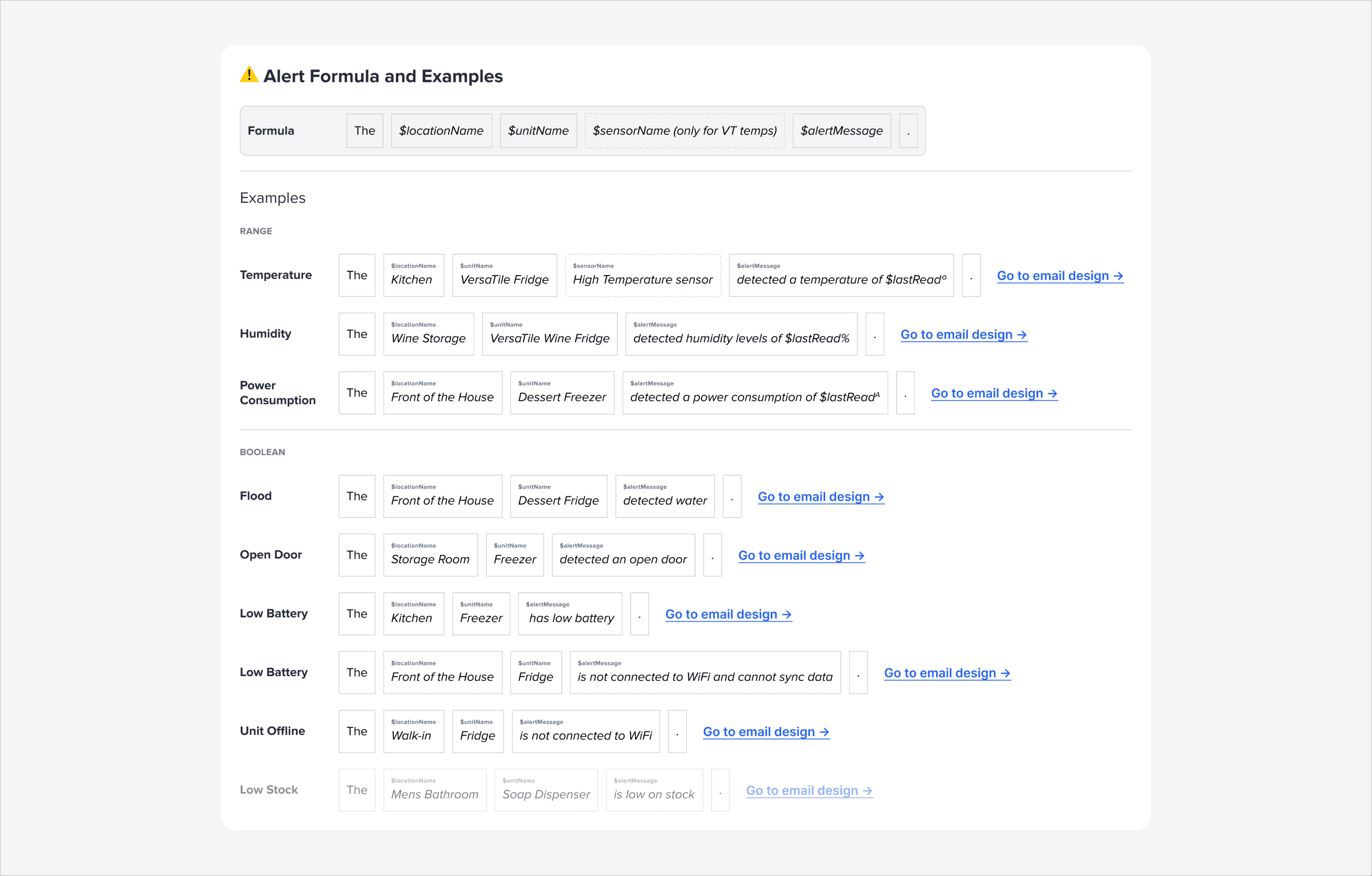
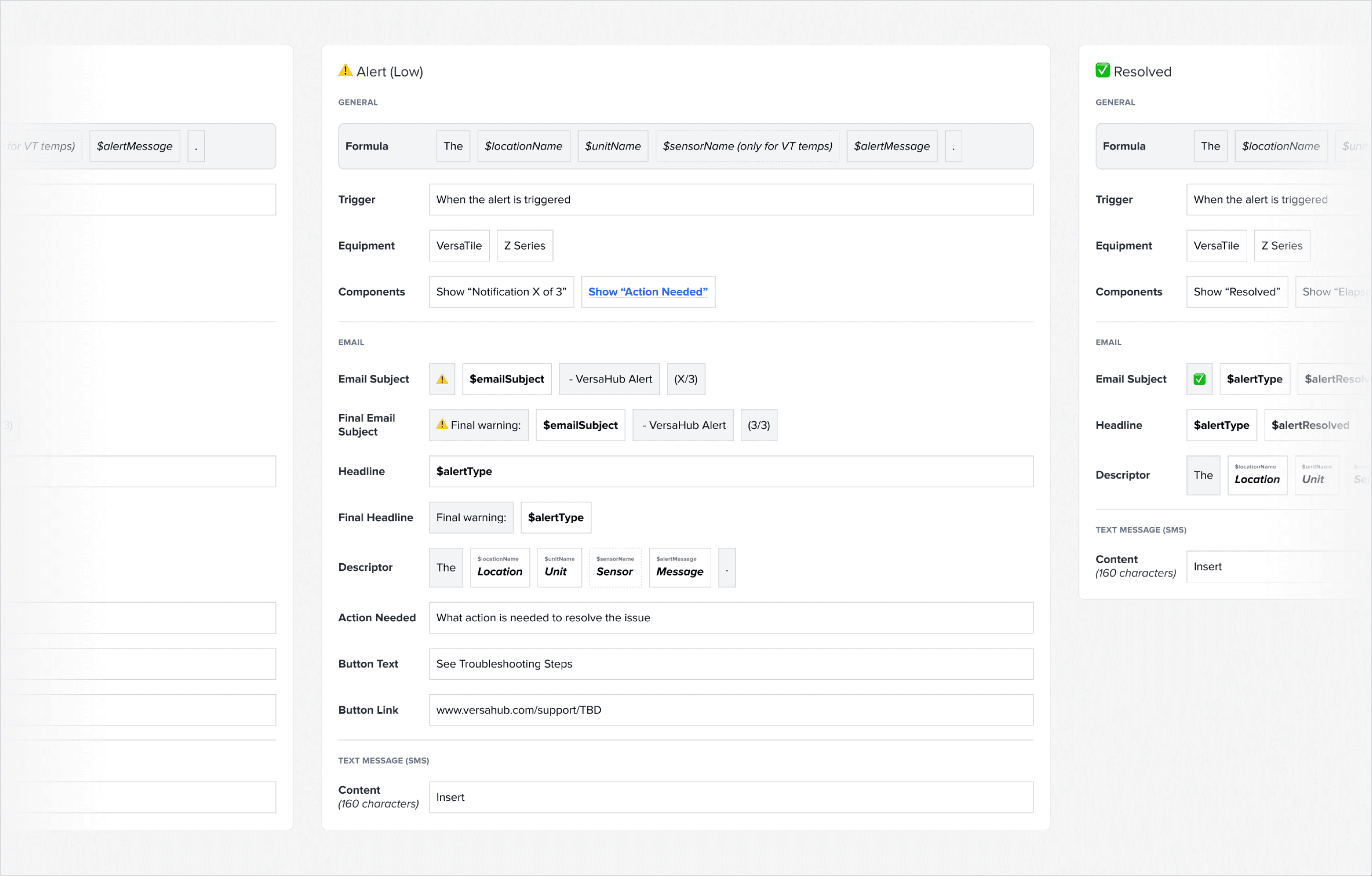
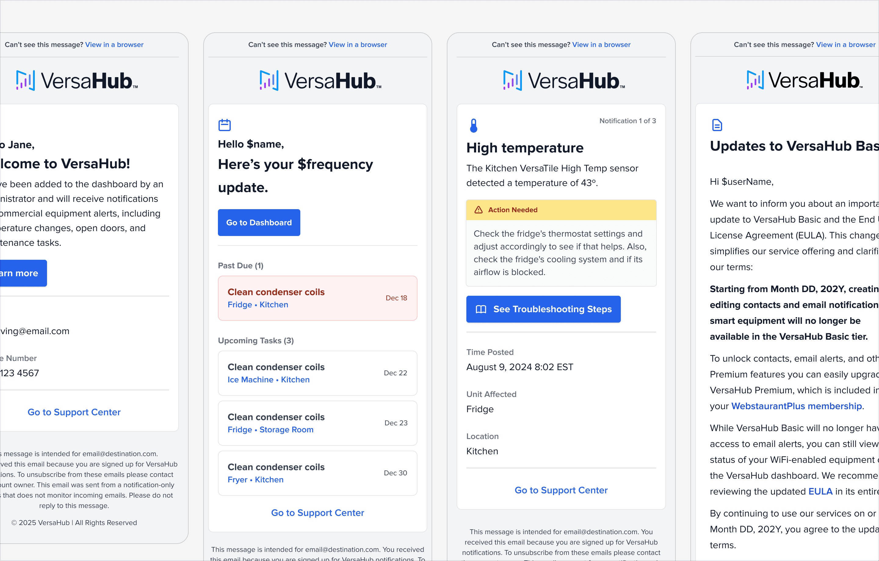
Developed standardized content formulas tailored to specific use cases, including Alerts and Resolved emails. These templates used dynamic placeholders for details like timestamps, thresholds, and actionable steps.
Visual Design
Employed an F-pattern layout to prioritize critical information while maintaining a professional, clean appearance. Adjusted layout elements to draw attention to critical areas, such as actionable CTAs and urgent details, improving the user’s ability to make informed decisions.
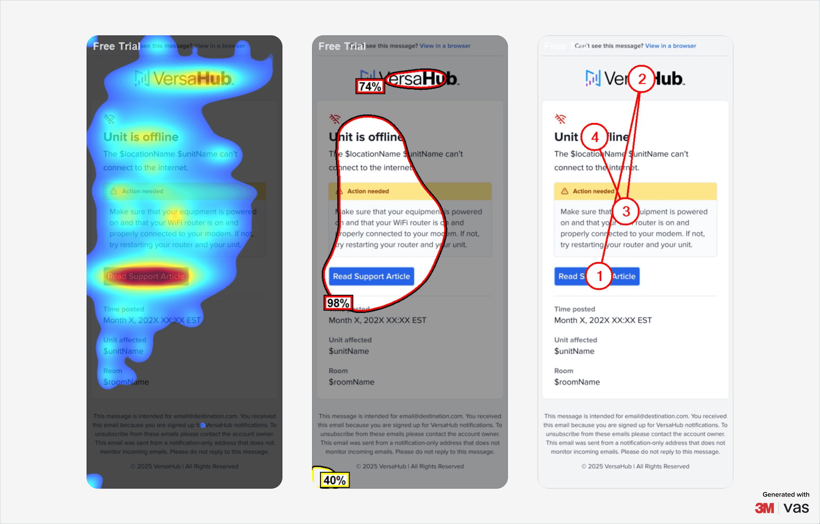
Optimized color contrast, line heights, and font sizes to meet AA accessibility standards, ensuring readability for all users. I also utilized the existing icon library for consistency, enabling users to quickly distinguish between multiple notifications.
Technical Details
Proposed a domain change to no-reply@versahub.com, enhancing brand identity and trust.
Recommended BIMI certification to boost credibility and signal authenticity to users.
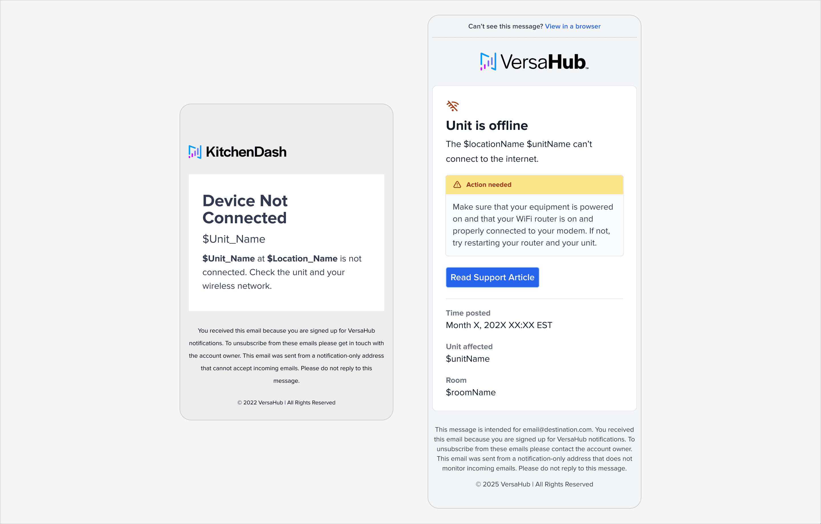
Added a footer message clarifying that the inbox was not monitored, setting clear user expectations and minimizing potential frustration.
Iterations
Revisited the notification strategy to address user concerns around repeated alerts. While hourly alerts were initially considered for persistent issues, the final solution included a user toggle to control notification frequency.
For SMS, evaluated the inclusion of OpenGraph images to enhance engagement but opted for text-only alerts to avoid redundant or excessive information. Iteratively refined SMS content, balancing brevity with clarity, and stripped redundant information to ensure essential details stood out.
Incorporated timestamps, affected unit details, and room fields in equipment alerts to improve context and actionability.
Collaboration
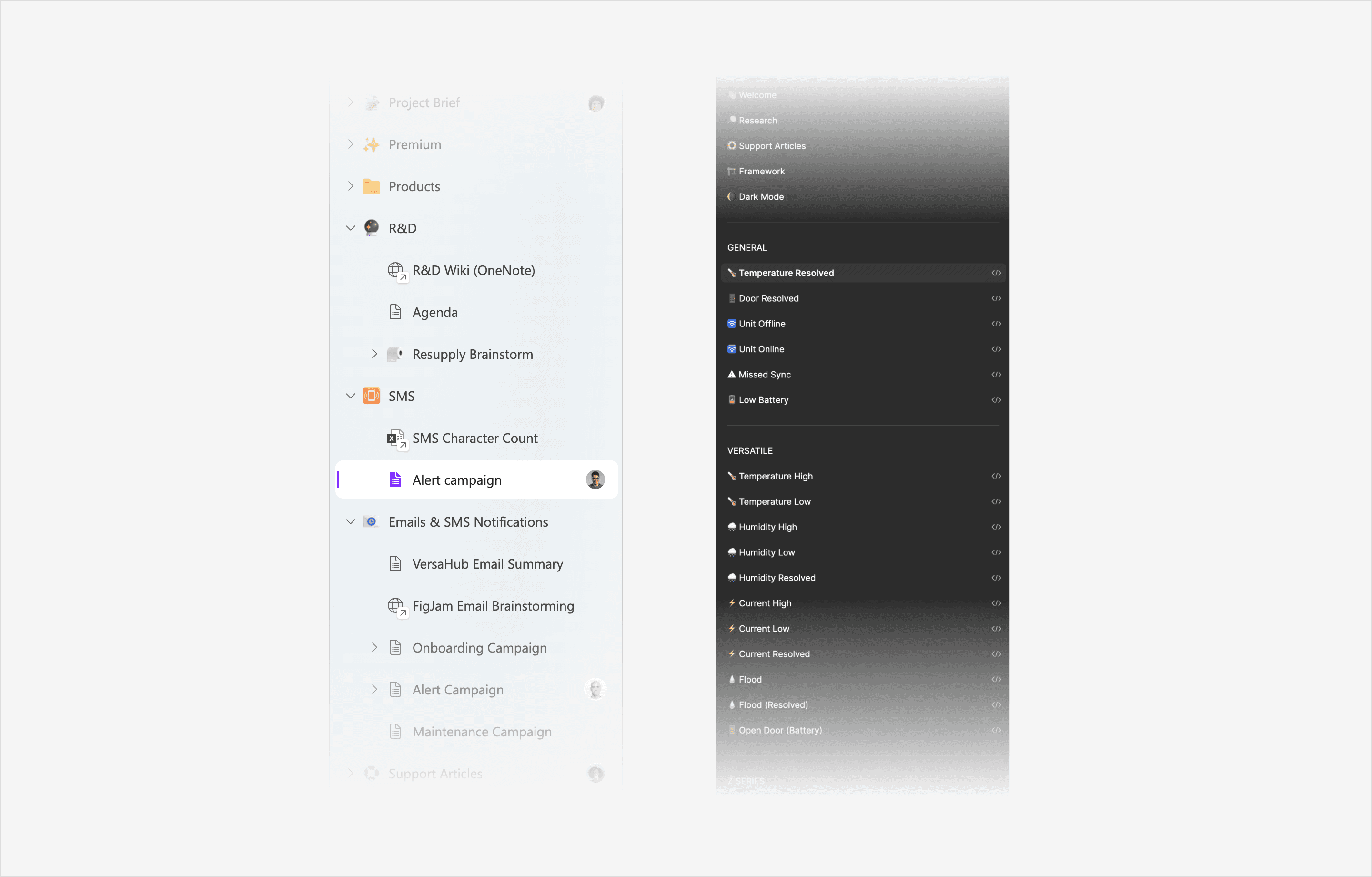
Advocated for the use of Microsoft Loop to align cross-functional teams (Product, Engineering, R&D), enabling seamless collaboration and tracking of requirements. Organized Figma files with clear statuses, marking components as “Ready for Development” or “Resolved” to maintain clarity during handoffs.
Wireframe
Systems
Next Steps
Looking ahead, the focus is on enhancing features, gathering insights, and optimizing the framework to meet evolving user and business needs. Introducing UI options for toggling repeat notifications will give users greater control over alert frequency, improving their overall experience.
Analyzing notification performance will help identify trends in user engagement, refine messaging strategies, and drive premium plan conversions. Continuous optimization of the framework will ensure it remains adaptable to emerging user needs while maintaining alignment with VersaHub’s evolving brand identity. Additionally, expanding onboarding efforts will target dormant customers, encouraging them to complete equipment setup and fully engage with the platform.
