Case Study
~35% Faster Activation, More Engagement
Optimized platform onboarding and equipment setup to cut completion time by 40%, reducing abandonment, and enabling seamless multi-device management.


Before
After
Project Overview
As lead product designer, I streamlined workflows using UX principles like Jakob’s and Fitts’s Laws to enhance usability and scalability. I designed a mobile-friendly interface, validated it through testing, and delivered high-fidelity designs. We launched VersaTile, a cost-effective retrofit device with built-in and additional sensor support, optimizing the platform for multi-device registration and retrofitting existing units.
Status
Shipped
Contribution
Lead Product Designer
Year
2022
Product
B2B SaaS Platform
Audience
Foodservice Professionals
Skills
UX Design & Strategy
Product Strategy
User Research
Prototyping & Testing
Design System
Content Design
Problem Statement
The setup process for existing equipment was overly complex, leading to frustration and drop-offs. Users struggled with unclear tier-specific benefits (Trial, Premium, Basic), and the inconsistent design made scaling difficult. These challenges also hindered user satisfaction, retention, and long-term adoption.
Results & Impact
The redesigned system reduced first-time setup time by 20% and additional equipment setup by 35%. Clearer tier communication boosted user retention, while a modular design system improved scalability and future-proofed the product. Collaboration across teams ensured the design aligned with user and business goals.
Discovery
When I inherited the project, VersaHub’s setup flow supported three equipment types: smart reach-in fridges and freezers, non-WiFi catalog units, and external units.
Audit
My first task was auditing the flow to address user pain points, improve accessibility, and ensure design scalability. One key issue was excessive clicks. For example, the initial step required users to select whether the equipment was WiFi-enabled via a dropdown menu. By displaying the options inline instead, we streamlined the process and saved users an unnecessary interaction.

From a user flow perspective, I identified that the current framework required users to insert the same information multiple times, like contacts and locations for each unit. This was not optimal because it added unnecessary redundant work for the user, increasing the duration and toll on the user’s cognitive load. There was a clear opportunity to streamline this process.

UI & Usability Issues
From a UI standpoint, we identified that the different modals had different heights, dynamic to their content, which violated Jakob’s Law. Modal heights were not taking full advantage of the mobile real estate screen. When content shifted dynamically in a modal, interactive elements like buttons moved unpredictably, making them harder to target and increasing cognitive load. From a content perspective, the language used was convoluted and added unnecessary complexity, weighing on the user’s cognitive load and decision time. This further increased friction in the setup process.
Understanding the Product
After the audit, I collaborated with the R&D team to understand VersaTile’s operation, including beeps, button configurations, and sensor parameters like ranges and thresholds. These insights informed a modular framework that supported existing equipment, accommodated VersaTile’s features, and prepared for future products. Comparing findings to existing smart devices helped refine and streamline the setup for a seamless user experience.

Define
To address the challenges identified in the discovery phase, I worked closely with product and engineering teams to restructure the wizard into two modular tracks. Together, we aligned on a scalable, cost-effective strategy that met user, technical and business needs.
Foundation
With this new foundation in place, we moved forward to develop detailed user flows, further refining the experience and creating a streamlined, adaptable framework for current and future needs.

Onboarding Track
The onboarding track simplified foundational tasks, a one-time only flow, that enabled users to quickly setup their business without requiring settings up a device immediately. It introduced a streamlined flow of existing steps, while introducing bulk room and contact creation. By reducing friction in these early steps, not only did the onboarding experience became smoother and more intuitive, but it paved the way alleviate equipment setups. The track was also designed with the Multi-Hub feature in mind, already on the roadmap.

Equipment-Only Track
Because of the expectation of high-demand due the nature and price point of the VersaTile, we set out to allow users to setup equipment as fast as possible. The equipment track was designed to handle multi-device configuration, with a focus on scalability, repetition and efficiency, while seamlessly feeling like one unified setup, even though being many. Users could view and add the product suite, or access vendor pages for additional equipment purchases.

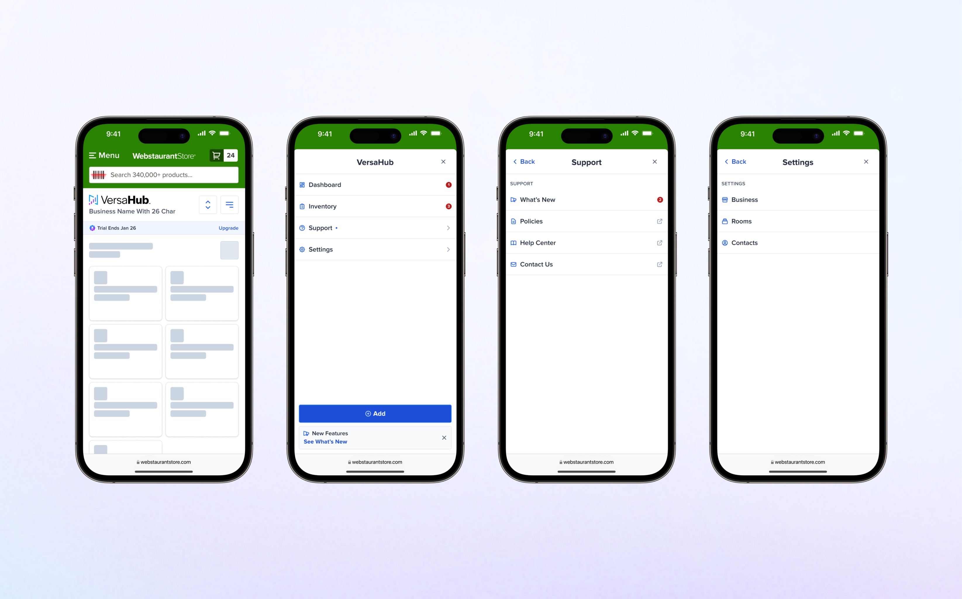
Access Points
Users could add devices directly from the VersaHub dashboard. I collaborated with R&D and data teams to design user entry points from the physical unit that leveraged the existing marketing site as a universal starting point. This ensured consistency across setups while gathering critical user insights through tools like Google Analytics and Microsoft Clarity to track QR scans and abandonment rates.
The flow diagrams below illustrate two primary entry points—QR code scanning and manual URL entry—optimized alongside the deferred setup option via the dashboard to deliver a more intuitive and efficient onboarding experience.

Information Architecture
These wireframes prioritized functionality and navigation, serving as a blueprint for the user experience while leaving visual design considerations for later stages. We increased user awareness of paid features, such as SMS and email notifications, by strategically highlighting during setup.

Early Equipment Setup Iterations
In the early stages, we explored using WPS for faster VersaTile setup but abandoned it due to security concerns identified with engineering. Without WPS, we focused on creating a more efficient setup process. Like other smart devices, VersaTile required users to temporarily connect to its WiFi for configuration. I proposed a simple 3-step offline carousel flow, which was refined through testing into a streamlined, click-efficient solution for the final implementation.

Wireframe
Building on defined user flows, I developed low fidelity wireframes in FigJam to establish the information architecture and modularity of key screens.
Information Architecture
These wireframes prioritized functionality and navigation, serving as a blueprint for the user experience while leaving visual design considerations for later stages. We increased user awareness of paid features, such as SMS and email notifications, by strategically highlighting during setup.
Early Equipment Setup Iterations
In the early stages, we explored using WPS for faster VersaTile setup but abandoned it due to security concerns identified with engineering. Without WPS, we focused on creating a more efficient setup process. Like other smart devices, VersaTile required users to temporarily connect to its WiFi for configuration. I proposed a simple 3-step offline carousel flow, which was refined through testing into a streamlined, click-efficient solution for the final implementation.
Systems
In the redesign, I prioritized creating a user-friendly interface that was clean, cohesive, and visually engaging. Leveraging existing components from the design system, I contributed new ones to address specific needs, such as a slider for parameter settings. The journey involved close collaboration with cross-functional (XFN) teams to iterate on high-fidelity designs, ensuring every component aligned with user needs and business goals while maintaining visual consistency.
Developing Core Components
To build a seamless user experience, I began by creating components that aligned with the information architecture (IA) defined during the wireframing stage. This ensured that each element supported the broader flow, providing consistency and scalability across the interface. The examples below highlight some of the core components developed during this phase.
Field Label
The field label component was built for flexibility, supporting actions like toggles, radio buttons, and checkboxes. It included secondary labels for premium or trial features and hoverable infotips for feature education. Configurable properties, such as show/hide options for infotips, helper text, and badges, ensured adaptability and seamless integration across the interface.
Input
The input component, a key element, required robust variants to cover all states, including error handling and dropdown functionality. I added features like grouping, hover states, active selection, and premium indicators while testing responsiveness for consistent behavior across screen sizes and integrated the icon system to ensure visual harmony throughout the product experience.

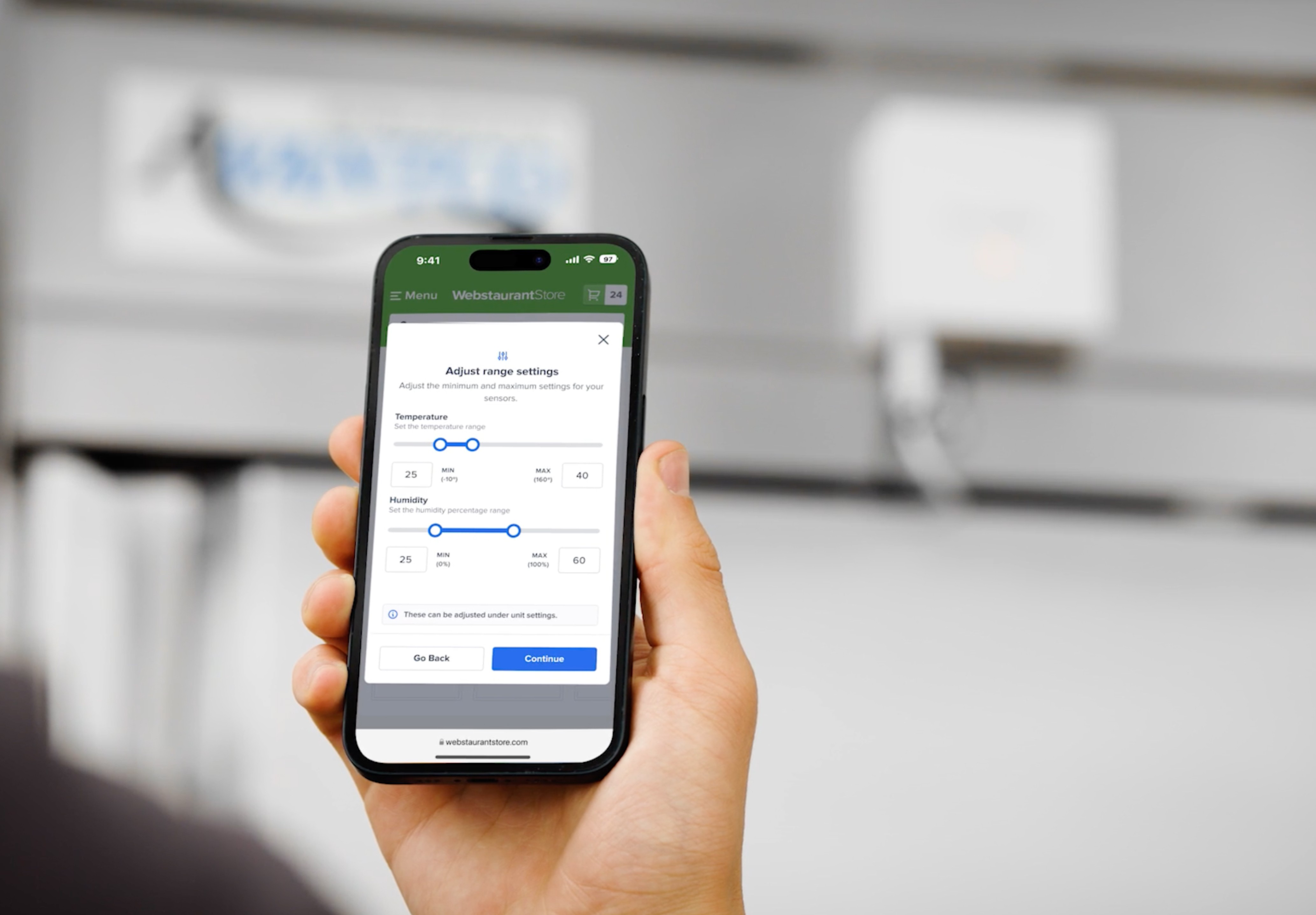
Slider
Recognizing a gap in the design system, I developed a slider component tailored for sensors with single or dual thresholds. This component enabled users to adjust parameters by tapping, clicking, or dragging, offering an intuitive way to set values. Built using atoms from the design system, the slider was designed for both functional simplicity and visual alignment with the rest of the interface.
Macromolecule
Once the micromolecules were established, I combined them into a reusable macromolecule component. This included advanced Figma properties for easy manipulation, enabling faster iterations and improving developer handoff efficiency. The macromolecule was designed with scalability and performance in mind, optimizing the system for future enhancements and coding efficiency.

Equipment Track Illustrations
To enhance clarity and distinguish similar steps, I designed equipment illustrations that complemented the copy and emphasized key actions. These visuals highlighted specific physical tasks, such as pressing a button or multiple buttons simultaneously, ensuring users could easily follow along and complete each step with confidence.

Design
Building on the completed components, I crafted cohesive layouts that aligned with the IA established during the wireframing stage. This step focused on assembling components into complete screens, ensuring consistency in visual hierarchy, accessibility, and interaction patterns, turning the modular design to a unified experience, iterating along the way.
Platform Onboarding Track
The goal of this flow was to help users complete setup quickly and reduce abandonment. We updated the contacts section, replacing the “Continue” button with “Skip” and “Finish” options, as contacts weren’t mandatory like room creation, which was essential for database functionality. Both steps could still be deferred for later. This change reduced drop-offs and allowed users to revisit and complete setup as needed.

Selecting Equipment Iterations
For users adding equipment from the dashboard or post-onboarding, I initially designed a three-card stack and iterated to a scalable layout showcasing all current and future equipment, prioritizing VersaTile for visibility. Repurposing existing dashboard icons saved time and ensured consistency. To address a gap, I replaced the bottom dialog with a vendor link, streamlining selection to a single tap for an intuitive flow.

VersaTile Setup
Guided by the wireframe structure and feedback from collaboration sessions, I designed a versatile setup experience tailored to VersaTile’s unique connection protocol. This included introducing sliders for threshold ranges and integrating clear instructions to help users navigate physical interactions seamlessly.

Progress Bar
We redesigned the progress indicator as a single percentage-based bar for a cohesive experience to adapt to different setup configurations without visually disrupting the experience, by replacing individual section-based bars. We also moved the progress indicator and positioned it above the action buttons, it ensures proximity to user actions, reinforces progress, and maintains a unified, space-efficient design.
Connection Step Iteration
The connection step had significantly changed from the original design, but user insights revealed confusion with the instructions. To address this, I proactively proposed a solution to the product owner and quickly developed a concept inspired by the original, incorporating clear, numbered steps for better clarity.

Retrofitting to existing setup flows
Using the same hierarchy, flow and design system components, I was able to successfully retroactively apply the system to existing equipment setups for the smart refrigerators and freezers and non-wifi units.
Non-WiFi (Catalog/External)

Smart Fridges and Freezers

Confirmation Screen
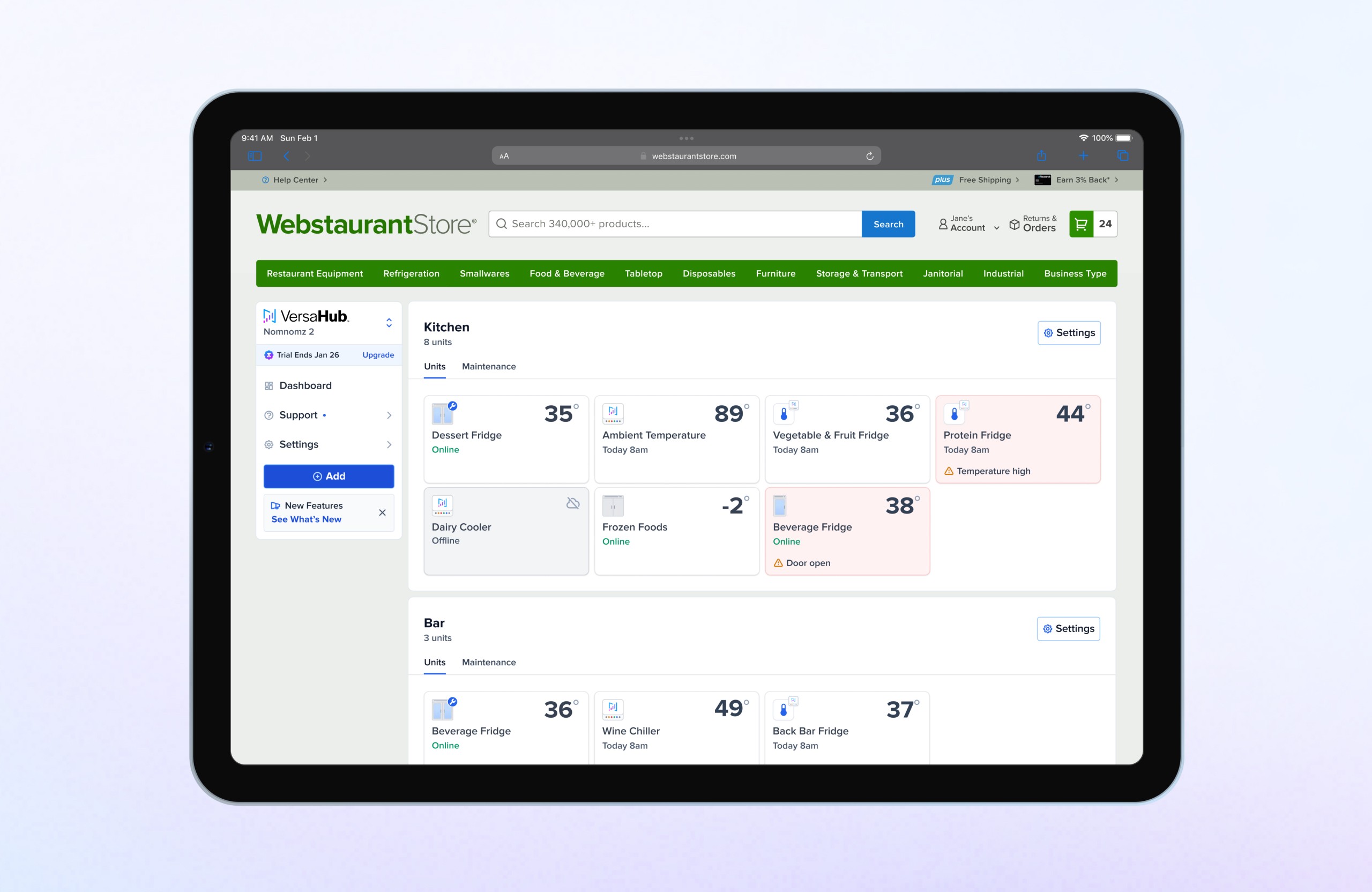
On the final screen, we confirmed the completion of the equipment setup. The main element on this page, was the focus of the unit card above the metadata, which is the same UI users will see in the dashboard, already reporting data. This helped cultivate familiarity and user interest in continuing exploring the platform after having followed several setup steps.

Testing the System
By maintaining the consistent modal structure used in earlier steps and organizing metadata with a UI that guided the user’s eye, the screen offered clarity and cohesion. I also tested the design to ensure it seamlessly accommodated other equipment types for scalability.

Mobile and Desktop
Since the designs were mobile-first, the same UI was adapted for desktop modals with increased padding. This approach saved development time by eliminating the need to recreate separate designs for desktop.