Case Study
IoT Navigation
Centralize settings, streamline workflows, and designi scalable navigation to enhance usability and support growth as an asset management platform.


Before
After
Project Overview
I led the VersaHub navigation redesign, creating a modular, scalable system with intuitive navigation, responsive design, and updated language. Key updates included a status bar, consolidated elements, and support for new features, preparing the platform for multi-hub functionality and future rollouts.
Status
Shipped
Contribution
Lead Product Designer
Year
2022
Product
B2B SaaS Platform
Audience
Foodservice Professionals
Skills
UX Design & Strategy
Product Strategy
User Research
Prototyping & Testing
Design System
Content Design
Problem Statement
Users faced challenges accessing key actions like adding units or rooms, especially on mobile devices, due to disjointed elements and inconsistent terminology and there was also no path to scale and display new features. Platform was rebranding from KitchenDash to VersaHub.
Results & Impact
The redesigned navigation received positive feedback post-launch, with users seamlessly performing key actions across platforms, accessing new resources effortlessly, and engaging more with subscriptions thanks to clearer trial indicators and premium tier explanations.
Discovery
Through a comprehensive discovery phase, I gathered insights from stakeholders, evaluated existing usability patterns, and analyzed competitors to uncover opportunities that would bridge user needs with business objectives.
To build a strong foundation for the design process, I began with a comprehensive discovery phase. This involved the following activities:
Stakeholder Interviews: Gathered insights into business objectives and scalability requirements to ensure alignment with long-term goals.
Heuristic Evaluation Analysis: Evaluated the current product’s usability and navigation structure to identify inconsistencies, usability issues, and areas for improvement.
Competitive Analysis: Researched similar apps and services to uncover industry trends, best practices, and differentiation opportunities.
Stakeholder Alignment: Shared findings with stakeholders to gather feedback, ensure agreement on identified pain points, and align on key opportunities for improvement.
Stakeholder Interviews
In this step, I collaborated with product and Research and Development (R&D) insights to gather insights into business objectives and scalability needs. One key finding was the need to include essential resources, such as the EULA and external links to support, to address the high volume of support requests customer service (CS) was handling. Additionally, we needed to improve visibility for the marketing site, which doubled as a support hub for existing customers, ensuring users could easily access help and information without requiring direct assistance.
Heuristic Evaluation
In this evaluation, I applied my UX knowledge and instincts to identify usability and UI issues, as well as user pain points in accessing and finding core features. For instance, the main dashboard mobile navigation faced several issues that hindered feature discoverability and did not follow UX best practices.
Mobile

Desktop
Desktop navigation had two levels, one for the dashboard view and one for the

Location and Contacts
One key pain point identified was the inconsistency in how location and notification settings were displayed across devices. On mobile, settings were presented as accordions that expanded to show options for contacts and notifications. On desktop, these settings appeared as bottom tabs, swapping content with the units view when expanded. This approach overwhelmed users with unnecessary complexity, increasing cognitive load and diluting focus, in violation of Hicks and Miller’s UX laws.
Additionally, users had to repeatedly enter the same contact information for multiple locations, revealing an opportunity to centralize settings and eliminate redundant data entry.

Competitive Analysis
With the main pain points identified, I explored how other IoT platforms addressed similar patterns, such as add buttons, notifications, and “what’s new” content. This ensured alignment with Jakob’s Law, leveraging familiar design conventions to enhance usability.

Stakeholder Alignment
I regrouped with stakeholders to present findings and align on key opportunities for improvement. We focused on addressing issues such as the lack of action hierarchy, the need for scalable navigation to accommodate future features, and optimizing the placement of elements like the premium status banner and support links for a more user-friendly experience. After discussion, we achieved alignment on these priorities to guide the next steps.
Define
To address the challenges identified in the discovery phase, I worked closely with product and engineering teams to restructure the main navigation into a unified and centralized experience. Together, we aligned on a scalable, cost-effective strategy that met user, technical and business needs.
User Flows
To establish a clear structure, I developed a flowchart mapping out primary and secondary navigation levels, user flows, and key user intentions. This process highlighted high-priority actions and informed the reorganization of navigation, centralizing resources like reports and settings for easier access.

What's New Content
We identified a valuable opportunity to showcase all feature releases through modals, which we integrated into the navigation to improve discoverability, educate users, and seamlessly cross-link to the e-commerce experience to drive conversions.
Realignment and Prioritization
The new framework required an essential, engineer-approved shift in the database structure to future-proof the experience and support upcoming feature releases. This phase focused on assessing capacity, setting timelines, and prioritizing high-value features for the MVP, while deprioritizing less-used elements like maintenance, reports, and activity due to low usage and the need for further refinement.
Wireframe
Based on the defined user flows, I created low-fidelity wireframes to establish the layout, ensure responsive consistency across viewports, and refine the information architecture and modularity of the navigation.
Early Explorations
One of the initial FigJam experiments involved introducing a horizontal navigation bar for core actions, paired with a complete sidebar for secondary navigation. While this approach addressed some usability challenges, it revealed redundancies in information and raised concerns about the desktop main navigation’s ability to scale effectively. However, the mobile concept highlighted a promising layout opportunity that could be adapted for both views and scale seamlessly.

Uniforming Design
The design was unified across devices by aligning desktop and mobile navigation patterns, standardizing key actions like “Dashboard,” “Add Unit,” and “Add Location.” This cohesive approach reduced redundancy, ensured consistent interactions, and maintained a scalable navigation hierarchy to support usability and future platform growth.

Responsive Layouts
These wireframes established constraints for API-driven content within the WebstaurantStore e-commerce platform, ensuring consistent layouts and responsive behavior across screen sizes. Fixed dimensions were applied to elements like the navigation panel and membership status for consistency, while main content containers were made dynamic to adapt seamlessly to various viewports. This approach prioritized functionality and navigation, creating a scalable blueprint for the user experience while deferring visual design refinements to later stages.

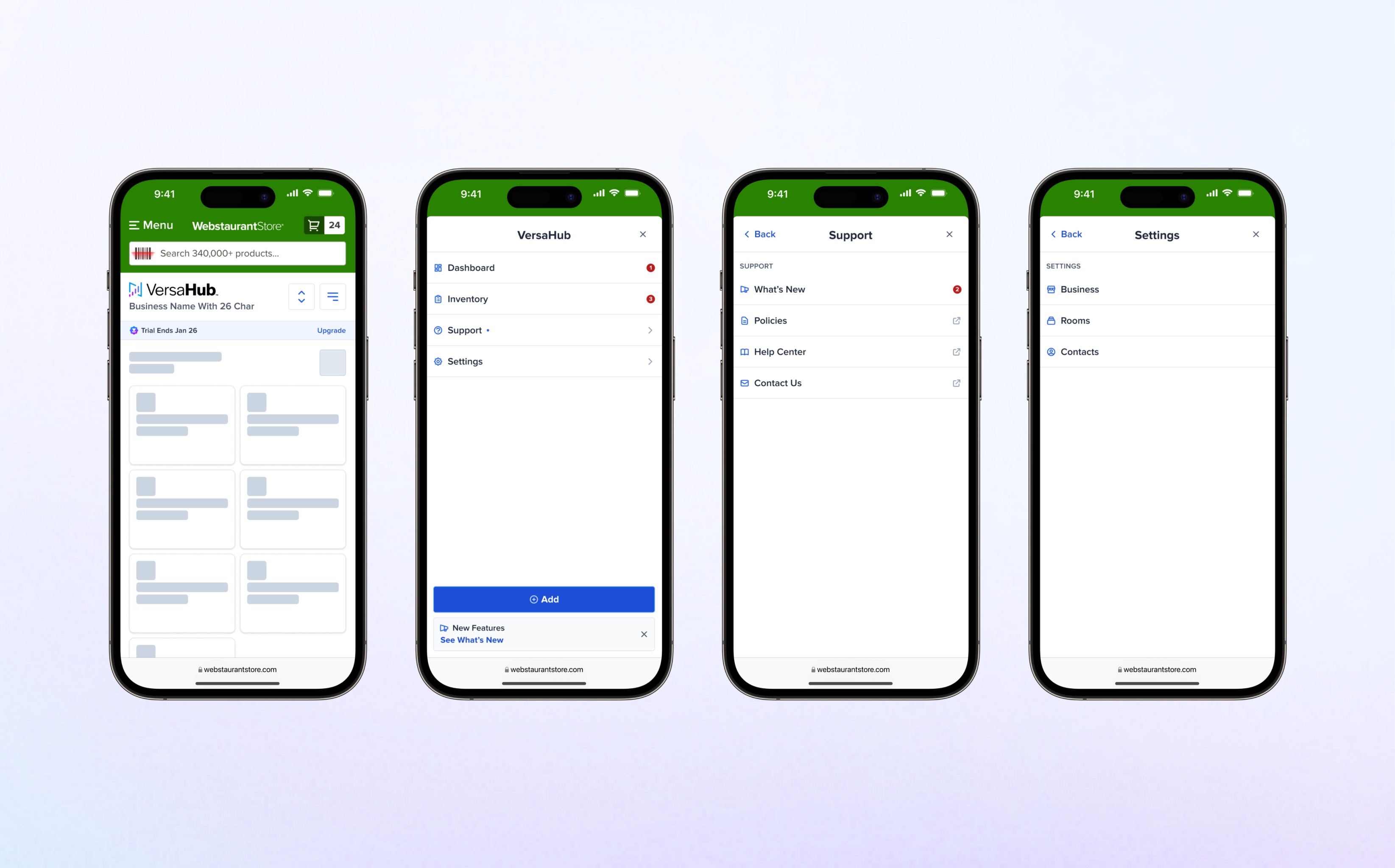
New Mobile Modal Experience
The redesigned modal improves usability and consistency with a clear Back button for navigation and a gesture-based option to close the modal by dragging the top bar. The scrollable viewport dynamically adjusts for clarity, while WebstaurantStore branding ensures a polished and cohesive design, prioritizing accessibility and efficiency for a seamless experience.

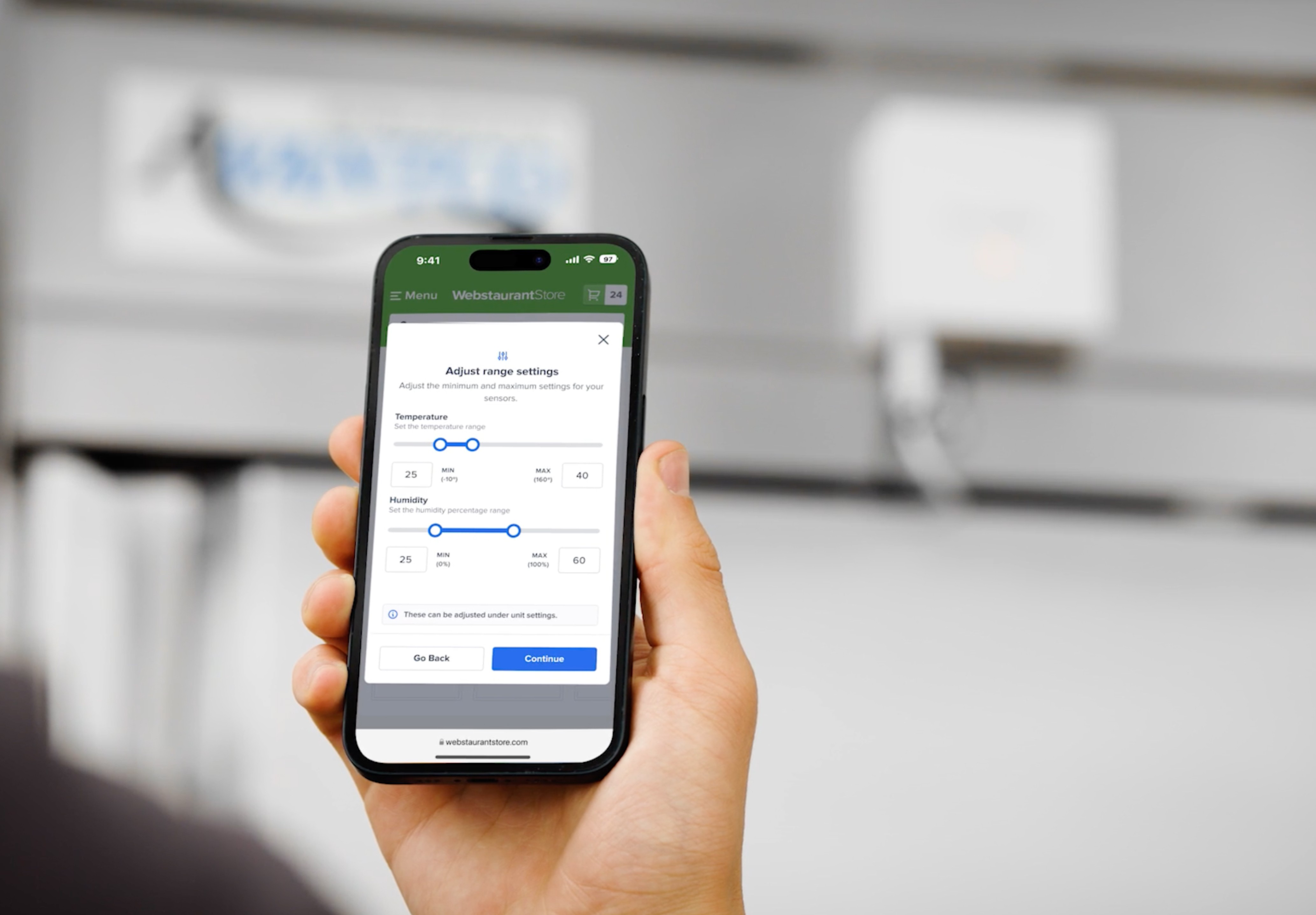
Locations vs. Rooms
We proposed shifting from multiple “Locations” to a single “Location” with nested “Rooms” for greater flexibility and improved user focus. Since most users manage a single business, showing multiple locations added unnecessary complexity. The rooms-based structure simplified navigation, allowing single-business users to fully leverage the platform while still accommodating those with multiple businesses. This approach also opened opportunities to streamline shared resources, such as contacts across rooms, but required further testing to ensure scalability and usability for all use cases.

Systems
The navigation redesign leveraged the existing design system to maintain visual consistency across colors, typography, and iconography. Some components created for this project were designed to be highly scalable, and applied globally, and some were exclusive to this molecule.
Designing the Premium Ribbon
The initial logo variant conveyed user status but disrupted navigation balance and created visual fragmentation with the premium banner. To resolve this, we introduced a compact ribbon custom component, displaying user status and expiration dates, strategically placed in the main navigation to increase awareness of paid features like SMS and email notifications.

Navigation Items
Designed as a global, reusable component, the navigation item ensures consistency across settings sidebars, menus, and modals. For mobile, taller buttons improve touch accuracy in clustered layouts. With adaptable states and properties like toggling icons and outbound links, this component could easily adapt to each use case, maintaining usability and scalability across the platform.

Navigation Clusters
Using the nav items component, I built and structured the primary and secondary navigation groups needed for both desktop and mobile applications, ensuring a cohesive experience across first- and second-level navigation.

Standardizing Modal Experience
A system was created to handle dynamic modal heights, with constraints (520px min, 768px max) to ensure usability and visual balance across devices. Navigation principles were integrated into sidebars within the modals, providing seamless access to features while maintaining consistency with the platform’s design framework. This approach ensured flexibility, scalability, and a cohesive user experience.

The modal framework was rigorously tested to ensure responsiveness and usability across all devices, maintaining consistency and clarity in varying screen sizes.

A slider animation was incorporated into the mobile drawer to enhance intuitiveness, using smooth transitions to guide the user’s focus as the drawer opens or closes. This dynamic feedback made this interaction feel natural and reinforces the hierarchy of information, improving usability and engagement.

Design
The visual design balanced clarity and aesthetics to enhance usability. Navigation modularity emphasized hierarchy, grouping related actions under intuitive labels for better discoverability. Additionally, the trial and upgrade ribbon used the design system’s accent colors to draw attention without disrupting the interface.
Layout Considerations
Mobile
I designed a full-height navigation modal for mobile to ensure accessibility and scalability, minimizing scrolling while using progressive disclosure to keep the interface intuitive. Optimized touch targets and gestural interactions, like swiping and tapping, enhanced navigation efficiency and supported more complex nested flows.

Desktop
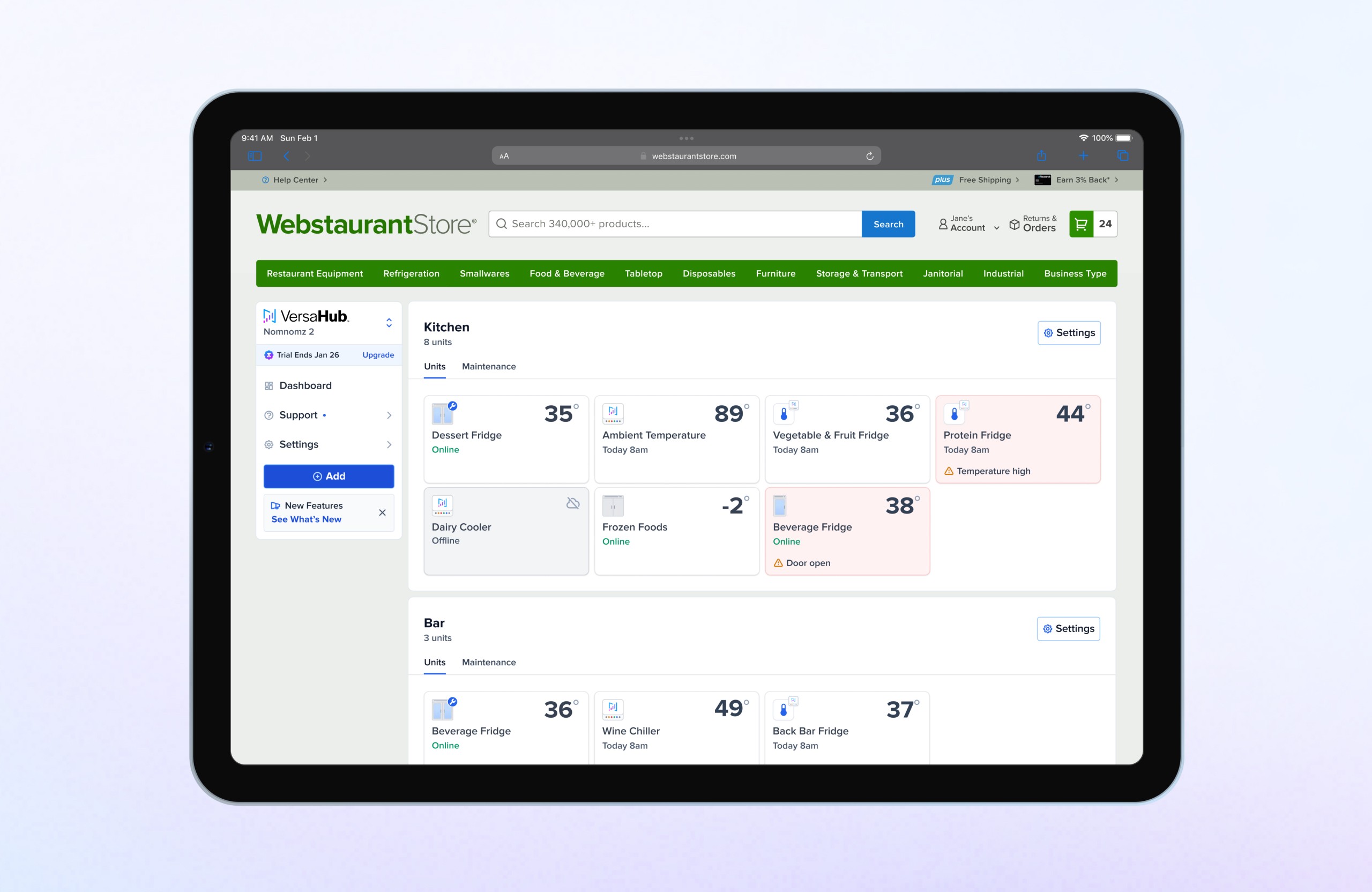
For desktop, I implemented a fixed-width navigation layout that accommodates secondary nested levels, enabling seamless expansion for new features. This adaptable design balances consistency with future-proofing, ensuring the navigation can scale without disrupting the existing structure. The approach maintains a cohesive experience across platforms, aligning desktop navigation with the patterns established for mobile while optimizing for larger screen real estate.

Logo and Status Tier Updates
An intermediary upgrade modal was introduced to enhance subscription awareness and clearly communicate premium benefits. User testing confirmed its effectiveness, increasing engagement, reducing confusion around Premium offers, and boosting user confidence. The modal also resolved the issue of redirects to the broader WebstaurantPlus page by focusing on VersaHub’s features, improving conversions, and ensuring scalability for future updates.

Final Enhancements

Feature Announcements
A dynamic “What’s New” banner was added to announce updates, linking users to a dedicated panel within the support section. Subtle unread indicators ensured awareness of new features without overwhelming the user experience.
Counter indicators
Red counters were integrated into the navigation to alert users about critical issues or important updates related to their units. Paired with a blue indicator on the main navigation, this ensured high-priority notifications were prominent without cluttering the interface.
Multi-Hub Update
A business name identifier was introduced under the VersaHub logo, enabling seamless switching between multiple businesses. The navigation also consolidated new actions, such as adding units, rooms, and contacts, into a unified menu for improved efficiency and clarity.