Case Study
IoT Rooms and Unit Cards
Improve main dashboard room experience to streamline user workflows, increase adoption, and prepare for growth.
Before
After
Project Overview
As Lead Product Designer, I led the redesign of VersaHub’s room views and unit cards, creating scalable, user-centered solutions. I restructured the information architecture, designed reusable UI components aligned with VersaHub’s design system, and collaborated with product owners and developers to balance user needs with technical feasibility and ensure efficient implementation and alignment with VersaHub’s strategic goals.
Status
Shipped
Contribution
Lead Product Designer
Year
Q4 2022 – Q2 2023
Product
SaaS IoT Platform
Audience
B2B Foodservice
Skills
UX Design & Strategy
Product Strategy
User Research
Prototyping & Testing
Design System
Content Design
Problem Statement
The platform's dashboard architecture and unit card design couldn't scale to support two key business initiatives: a new multi-user feature and a low-cost hardware offering.
Results & Impact
The redesign not only improved data visualization and dashboard clarity but also established a scalable foundation to support new equipment and expanded functionalities. By leveraging modular systems, we minimized tech and design debt, ensuring future growth could be achieved efficiently and seamlessly.
Discovery
A comprehensive review of the current interface uncovered opportunities to improve usability, clarity, and scalability. By addressing inefficiencies and aligning with industry standards, this process laid the groundwork for a user-centered design capable of supporting future growth.
Steps Taken:
UI Audit: Assessed layout issues, information hierarchy, and unit differentiation challenges.
Heuristic Evaluation: Identified usability pain points through personal insights and user-focused analysis.
Competitive Analysis: Benchmarked industry practices to guide intuitive and familiar user journeys.
Iconography Exploration: Refined visual styles to enhance clarity and ensure brand consistency.
UX Audit
The UI audit identified several usability challenges, including poor emphasis on critical data, oversized Wi-Fi icons creating visual noise, and disruptive accordions for managing notifications. It was also difficult for users to distinguish between units at a glance due to a lack of visual differentiation. Additionally, the placement and design of the “Edit” button reduced usability, and the overall layout lacked a clear information hierarchy. These issues highlighted the need for a more structured and intuitive interface to improve interaction and decision-making.

Foreign Functions
Contact and notification settings were previously embedded within each room, forcing users to duplicate actions, switch between tabs or accordions, and deal with unnecessary context switching. This not only added cognitive load but also derailed the main focus of the dashboard—providing a comprehensive view of unit statuses. The issue was further amplified on mobile devices, where inconsistent layouts created additional confusion and wasted time.
Heuristic Evaluation
As a smart home “power user,” I leveraged personal insights to identify common pain points when interacting with similar platforms. This evaluation gave me a solid foundation to proactively address usability challenges, ensuring the design avoided common pitfalls and anticipated user needs. By adopting this perspective, I was able to identify opportunities for improving the platform’s functionality and overall user experience.
Competitive Analysis
A competitive analysis was conducted to study how mainstream platforms handle data visualization and design their primary dashboards. By examining their user journeys, we ensured that the redesigned experience was intuitive and aligned with familiar industry patterns, avoiding unnecessary complexity. Given the niche audience, it was crucial not to create a product that felt too unfamiliar or complicated. This analysis provided a strong benchmark for usability while maintaining focus on the unique needs of VersaHub’s users.

Exploring Visual Icons
While transitioning the unit cards to pull images directly from the catalog API, it became clear that the images were too small to provide the necessary detail for users to identify individual units. To solve this, I researched modern iconography styles that could achieve better unit distinction. During this process, I discovered that WebstaurantStore already had an established iconography style. Although somewhat outdated, it served as a valuable starting point to build upon. This exploration ensured that the new visual system would offer both clarity and alignment with the brand’s evolving design language.

Define
A thorough analysis of the existing interface revealed the need for more intuitive data visualization and improved unit card designs to provide users with better context for informed decisions. The design also needed to support new equipment types and align with VersaHub’s updated branding.
Understanding the User Journey
I focused on refining VersaHub’s user journey to enhance equipment monitoring and issue resolution. By analyzing workflows and identifying pain points, I simplified complex processes and streamlined navigation to prioritize clarity and usability. This approach ensured a seamless and efficient experience for users, allowing them to quickly detect issues, view detailed data, and take corrective actions without unnecessary friction.

Contextual Layout
After analyzing the interface and user journey, I identified layout constraints and defined design boundaries to optimize card placement and structure. This informed decisions on the optimal number of unit cards to display while ensuring space for vital contextual data, such as alerts and room-level details, balancing usability and scalability for future needs.

Defining Card Information Hierarchy
Insights from the discovery phase highlighted the need for a more intuitive approach to data visualization within unit cards. This process focused on optimizing information architecture and establishing a clear hierarchy to balance content relevance and accommodate diverse equipment types. The result was a modular, adaptable card system capable of seamlessly consuming and displaying data for both smart and non-WiFi units, ensuring scalability and consistency across the platform with a single versatile component.

Problem Definition
The existing VersaHub interface struggled with unintuitive data visualization and unclear unit card designs, limiting users' ability to make informed decisions. The platform needed a scalable solution to accommodate upcoming smart janitorial equipment as well, which would feel out of place next to kitchen equipment. Constraints in layout design required optimizing space for multiple cards and contextual data, while defining a clear information hierarchy ensured adaptability and consistency. Strategic alignment with R&D and PM was essential to balance user needs, technical feasibility, and long-term goals.
Wireframe
In order to enhance data visualization and optimize room management, I emphasized modularity and scalability by carefully structuring unit cards and room layouts. The design prioritized clarity, intuitive navigation, and responsiveness to deliver a streamlined and efficient user experience, ensuring clear separation while maintaining visual cohesion between elements.
Reorganizing Card Layout
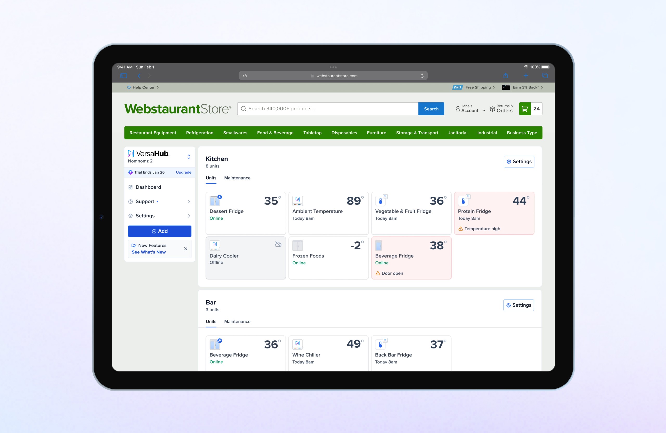
For the unit cards, I developed a layout that separated information into three levels of importance. Primary details, such as the unit name, icon, and real-time temperature readings, were given the most prominent placement. Secondary information, like connection status and syncing timestamps, followed. Finally, tertiary details, such as alerts, were displayed with clear visual prioritization to help users quickly identify critical issues.

Testing Card Modularity
To validate the framework, I tested various use cases by reconfiguring the modular elements to ensure flexibility and scalability. This process helped define the necessary components for each card, along with their different states, such as notifications, connectivity, and status updates.

Reconfiguring the Main Dashboard
Building on the card framework and its information architecture, I restructured the main dashboard to optimize grouping and organization. This included refining card placement, updating button language from “Edit” to “Settings” for clarity, and centralizing notifications, alerts, and contact settings into a unified sidebar. These changes created a cohesive structure, improving usability and ensuring the dashboard layout aligned with the card system’s design principles.

Building Responsive Breakpoints
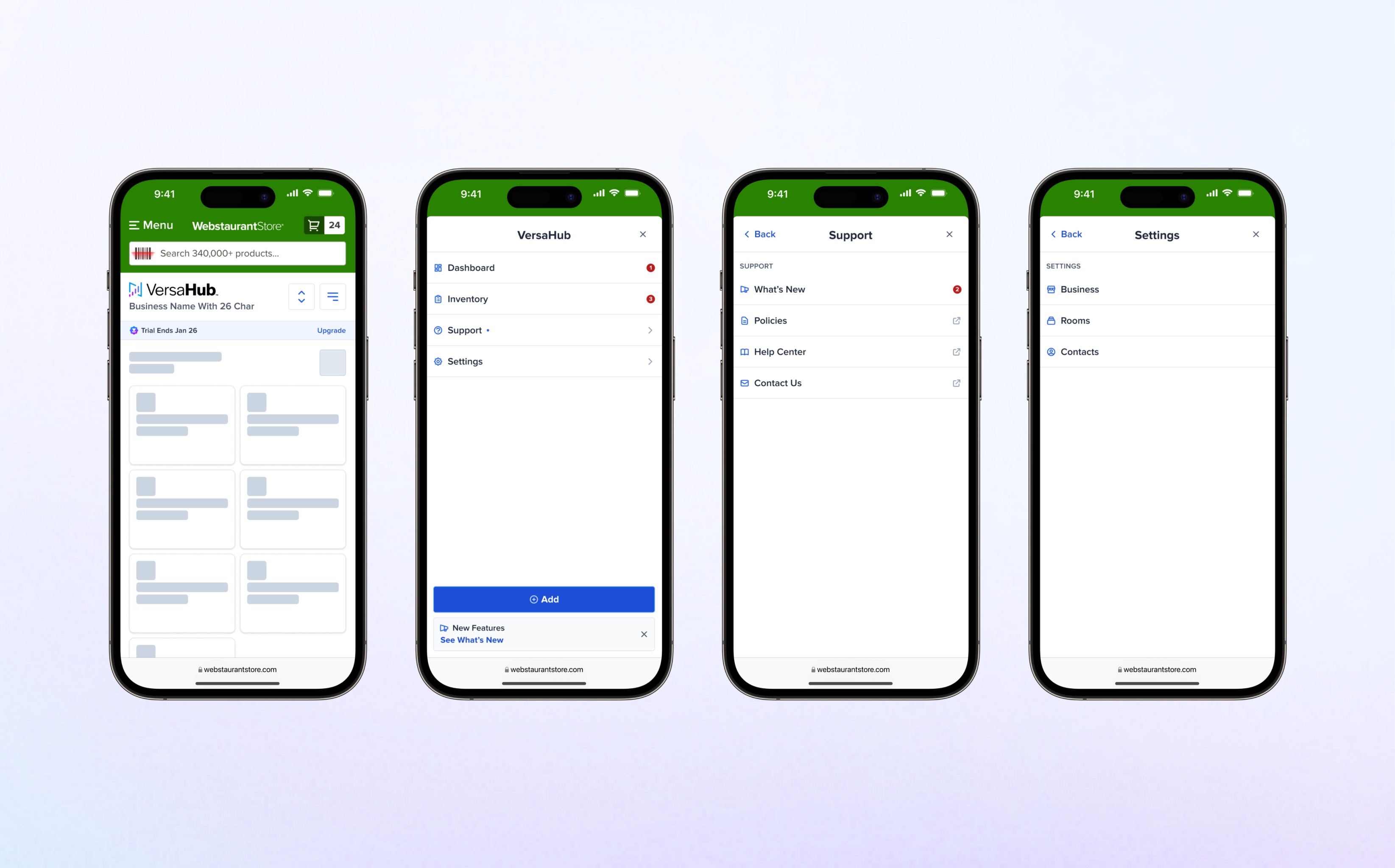
To ensure a seamless experience across devices, I developed responsive breakpoints for mobile, tablet, and desktop screens. The layout adapts dynamically to reduce cognitive load, with vertical stacking on mobile for simplicity and grid-based arrangements on larger screens to provide clear, organized overviews.

Systems
I developed a responsive framework with breakpoints and centralized settings to streamline workflows and eliminate redundancy. Zero-state views encouraged engagement, while reusable components—built with atomic design principles—handled edge cases and met WCAG standards. Documented in Figma, the system ensured flexibility and efficient implementation.
Designing Equipment Icons
To improve clarity in identifying equipment types, icons replaced small product images across the platform. Consistent use of these icons in the unit cards and across the platform ensured continuity and familiarity, creating a cohesive experience for users.

Unit Card Variants
To ensure the design worked across devices, I created a responsive framework with defined breakpoints for various screen sizes. For empty rooms, I designed a zero-state view that encouraged users to add or purchase equipment. Centralized settings were added to the main navigation, simplifying workflows by allowing users to manage notifications and contacts from a single location. This adjustment eliminated the need for redundant room-specific settings.

Design System Contributions
The updated design was built using atomic design principles. Components such as card surfaces, icons, and alert indicators were created as standalone modules, making them reusable and scalable for future updates. Each component accounted for edge cases, such as loading states, disconnected units, and alerts, and met WCAG standards for accessibility.

Design
I refined the designs to improve clarity and decision-making by adopting an F-pattern layout, introducing a distinct offline state, and separating maintenance from critical alerts. These changes reduced user confusion and false panic while streamlining visual design. Instead of a complex color-coding system, I leveraged visual hierarchy to highlight critical alerts and accommodate edge cases, such as low-battery or disconnected units, without overwhelming the user.
Unit Card Evolution
During the project, we utilized an interim component to allow developers to test data points early. While these cards provided improved clarity compared to the previous iteration, significant issues with data visualization remained, requiring further refinement.

Maintenance Alert
Maintenance alerts were bundled with critical alerts, reducing clarity and prioritization. When both occurred, the system defaulted to a generic “2+ notifications” message, overshadowing critical issues. To solve this, I introduced a subtle, unique icon for maintenance tasks that draws attention without distracting from high-priority alerts.

Offline State Refinement
The offline state was previously treated as an error state, similar to critical alerts, which caused confusion and unnecessary panic for users. To resolve this, I introduced a distinct disabled-like state that clearly differentiates offline units from errors. This new design accurately communicates the priority of user actions, reducing confusion and ensuring a more intuitive experience.

Card Layout Pattern
The card layout disrupted visual flow with elements in all four corners. I applied an F-pattern structure to guide the user’s eye naturally by extracting the bottom alert from its container, improving clarity and focus on key data points.

Designing Room Zero States
To address a key limitation, I introduced room zero states, allowing users to set up and configure rooms without equipment. This update provides a guided onboarding experience, reduces friction, and helps users establish their platform structure before adding units.

Finalizing Responsive Breakpoints
I finalized breakpoints ranging from extra small for older devices to extra large for wide monitors and TVs, ensuring compatibility across all devices used by our target audience. This included setting defined min and max widths for both the room container and unit cards to maintain consistency and usability at every screen size.


