Case Study
Pur Water
Reimagine water filter tracking by digitizing workflows, designing an intuitive timeline UI, and integrating iOS and watchOS for seamless user experiences.
Before
After
Project Overview
Status
Shipped
Contribution
Lead Designer
Year
2015
Product
UX/UI Design, App Design, Branding
Audience
Lead Product Designer
Skills
UX Design & Strategy
Product Strategy
User Research
Prototyping & Testing
Design System
Content Design
Problem Statement
Results & Impact
Goals
The goal was to transform an outdated, manual process into a seamless, digital experience that aligns with modern technology habits. With this Pur concept, users could gain a simplified, visual way to monitor their filters lifespan and maintain their water quality without extra effort.
Discovery
Define
Design Process
Research & Concept Development
I began by conducting some personal research to understand the pain points I faced when tracking my pur water filter usage. Part of this was me forgetting to replace filters on time due to the lack of clear, consistent reminders. Using these insights, I developed initial wireframes to define the app concept, focusing on replacing outdated manual methods with an effortless digital solution.
Branding & Visual Design
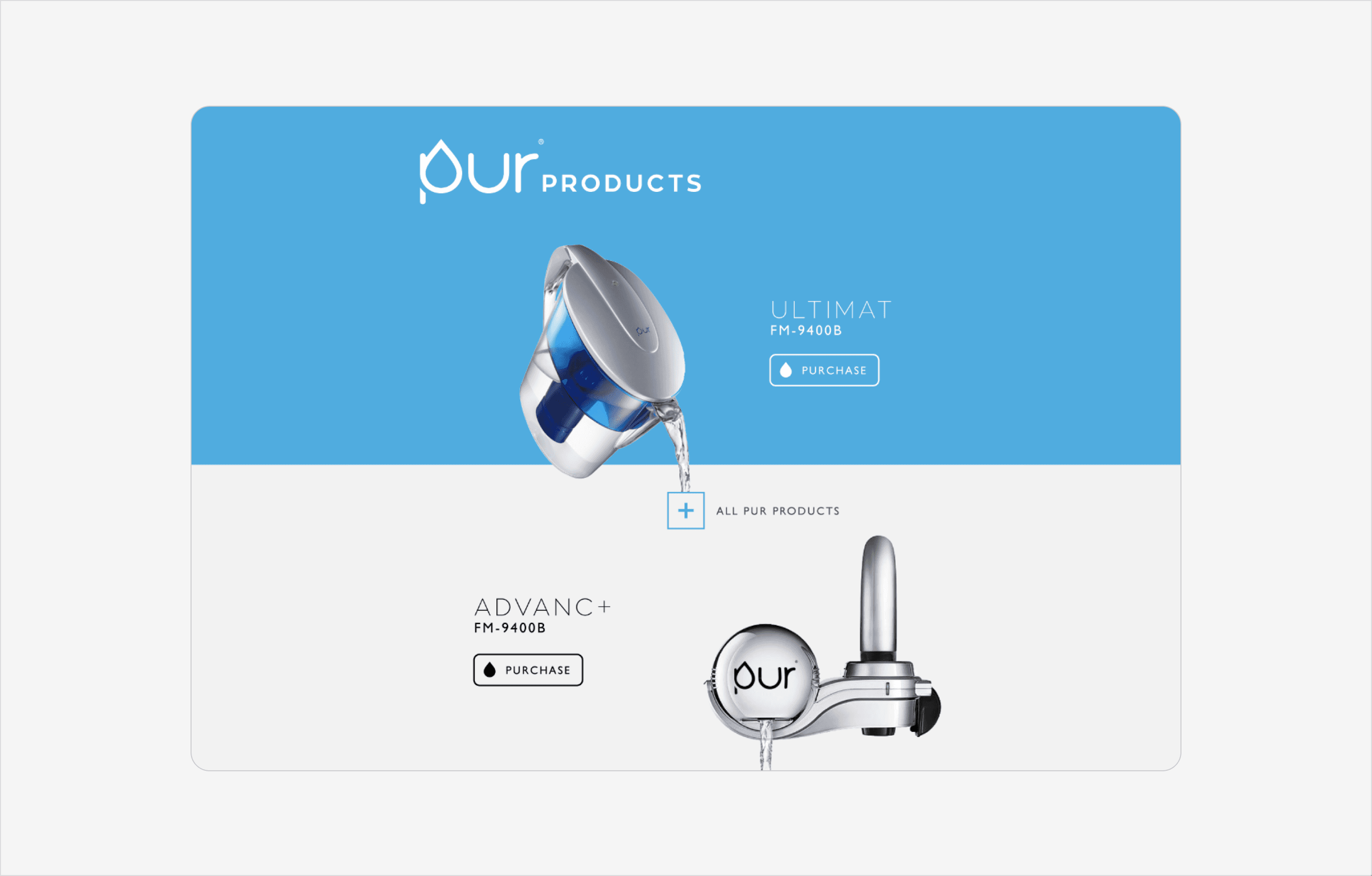
The branding reflects the purity and simplicity of water. I designed a modern logo, cohesive color schemes, and typography that convey cleanliness and clarity. These elements informed a consistent design language that unified the iOS and watchOS experiences.
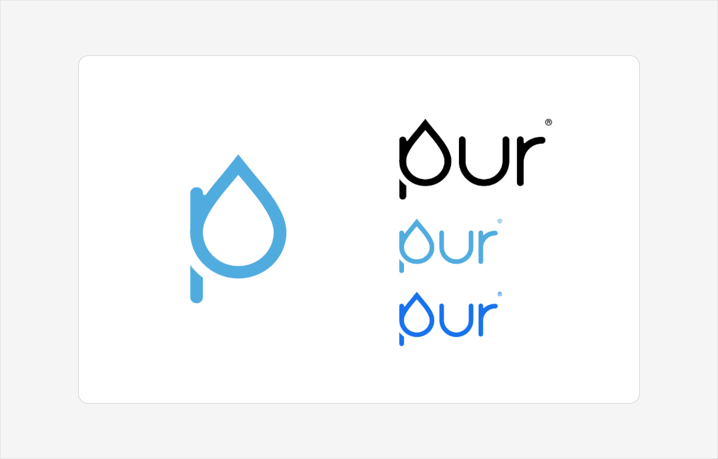
Logo and Branding
The branding for Pur emphasizes clarity and modernity, inspired by the purity of water. The logo features clean, fluid lines that evoke water’s movement and simplicity, paired with a minimalist typeface for a contemporary look. The color palette is dominated by shades of blue and white, reflecting water’s purity and reinforcing the app’s focus on clean, fresh design.
This branding guided the UI design, ensuring a cohesive experience across both iOS and Apple Watch. The result is an interface that feels as effortless and natural as the product’s purpose.
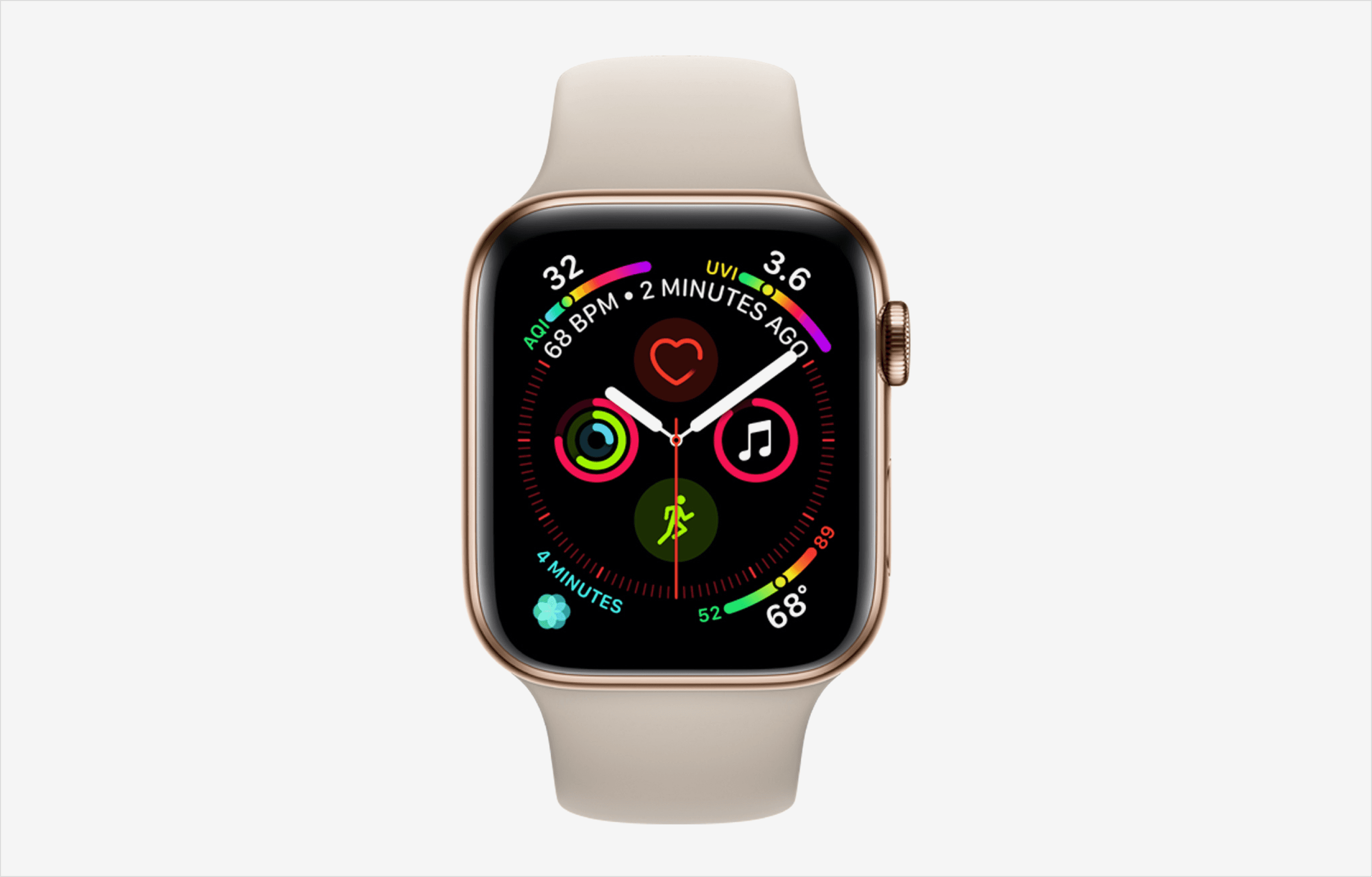
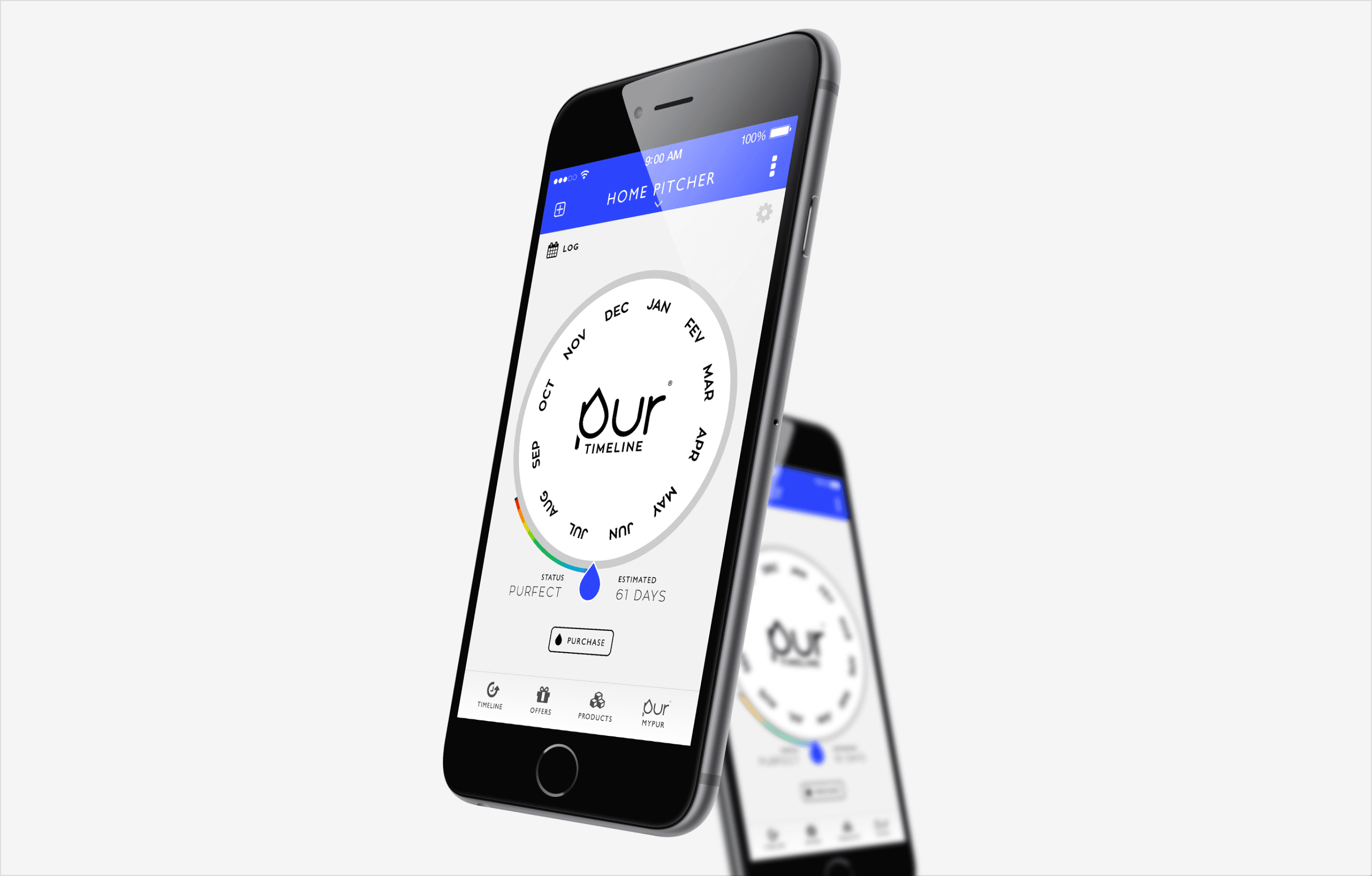
Timeline UI Design
The timeline view is the app’s centerpiece. It uses a gradient that transitions from green to red as the filter’s lifespan progresses, providing users with a quick, visual summary of their filter’s health. This design eliminates the need to dive into detailed menus, making it faster and more intuitive to check the status.
For example, as a filter nears its replacement date, the timeline gradually shifts to red and triggers a notification. This design prioritizes clarity while keeping the interface simple and approachable.

Wireframe
Systems
Next Steps
Looking ahead, I plan to continue exploring app design, focusing on solving everyday problems with elegant and intuitive digital experiences. This project sparked a deeper interest in refining my ability to balance functionality with simplicity, and I am eager to pursue more opportunities that allow me to hone these skills.