Case Study
Google Home App
Reimagining the Google Home app to enhance usability, optimize navigation, and simplify smart home management.
Before
After
Project Overview
Status
Shipped
Contribution
Lead Product Designer
Year
2020
Product
App Redesign Concept
Audience
Lead Product Designer
Skills
UX Design & Strategy
Product Strategy
User Research
Prototyping & Testing
Design System
Content Design
Problem Statement
Results & Impact
Goals
The primary goal of this redesign was to simplify and improve the user experience for managing smart home devices. This included creating a more organized layout, reducing steps to access controls and settings, and optimizing the visual hierarchy to ensure key information and actions were easy to locate.
Additionally, the redesign sought to align with Google’s ecosystem and visual standards for a cohesive brand experience. This project also served as an opportunity to evaluate Adobe XD’s capabilities for prototyping and interaction design while exploring new approaches to app design.
The redesign introduced:
Primary and secondary actions prominently displayed on homepage cards for quick access.
A tab organizer and sort functions to streamline navigation and reduce scrolling effort.
Material Design icons and cohesive typography to align with Google’s branding.
A cleaner layout with a clear hierarchy to improve usability.
Dark mode for user comfort in low-light environments.
These enhancements aimed to resolve usability challenges while providing a more intuitive, user-friendly app experience.
Discovery
Define
Design Process
Research and Analysis
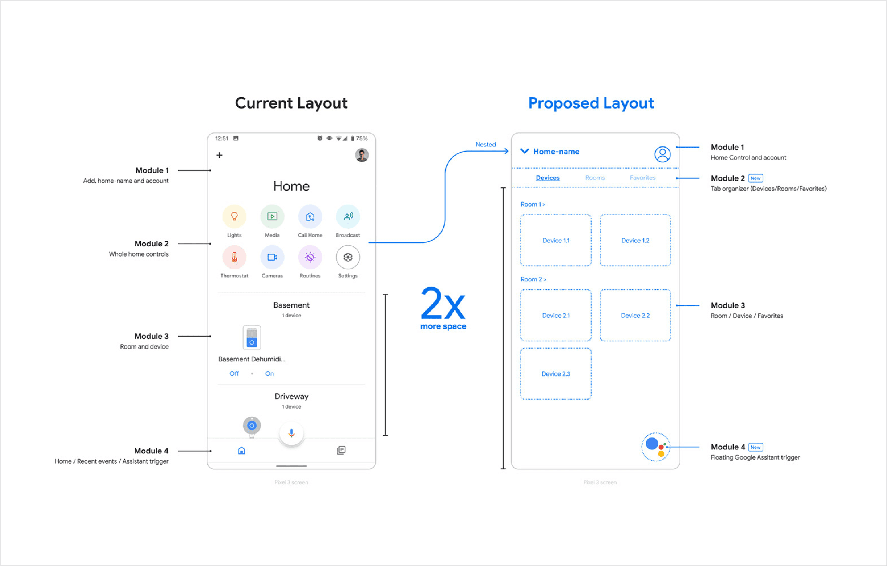
I began by analyzing the current Google Home app to identify key areas for improvement. Informal feedback and my own observations highlighted inefficiencies in navigation, poor use of screen space, and a lack of structure in the interface. These insights informed the direction of the redesign. Here's my teardown:

Module 1 — Add / Profile / Home-name
This area wastes too much screen space between the plus-icon, the user-profile and the home-name which is a field that is not a user priority.
The home-name should be smaller and tucked away on the top left of the app.
Module 2 — Home controls
These home controls contain a lot of items that are secondary.
Move these controls under a main-menu option. This will open up space for device-view.
Module 3 — Room and devices
Room and device layout are stacked in a way that takes too much space from the main view.
Create a card layout to help better organize and categorize devices, save time and space and, making it easy for the user to quickly access devices. Also, rework primary actions to allow the user to quickly trigger devices to help save time.
Module 4 — Toolbar
The highlighted area is being generated by an oddly positioned microphone button, therefore unnecessarily wasting space. The drawer/tab section (home/events) offers limited use and seems disconnected.
Replace the drawer section with a tab layout, moved to the top. Events gets moved as part of the new Home Control component. Replacing the microphone icon with the Google Assistant logo, permanently floating on the bottom right corner of the app. This allows the user to quickly trigger the assistant to save time.
Wireframing and Prototyping
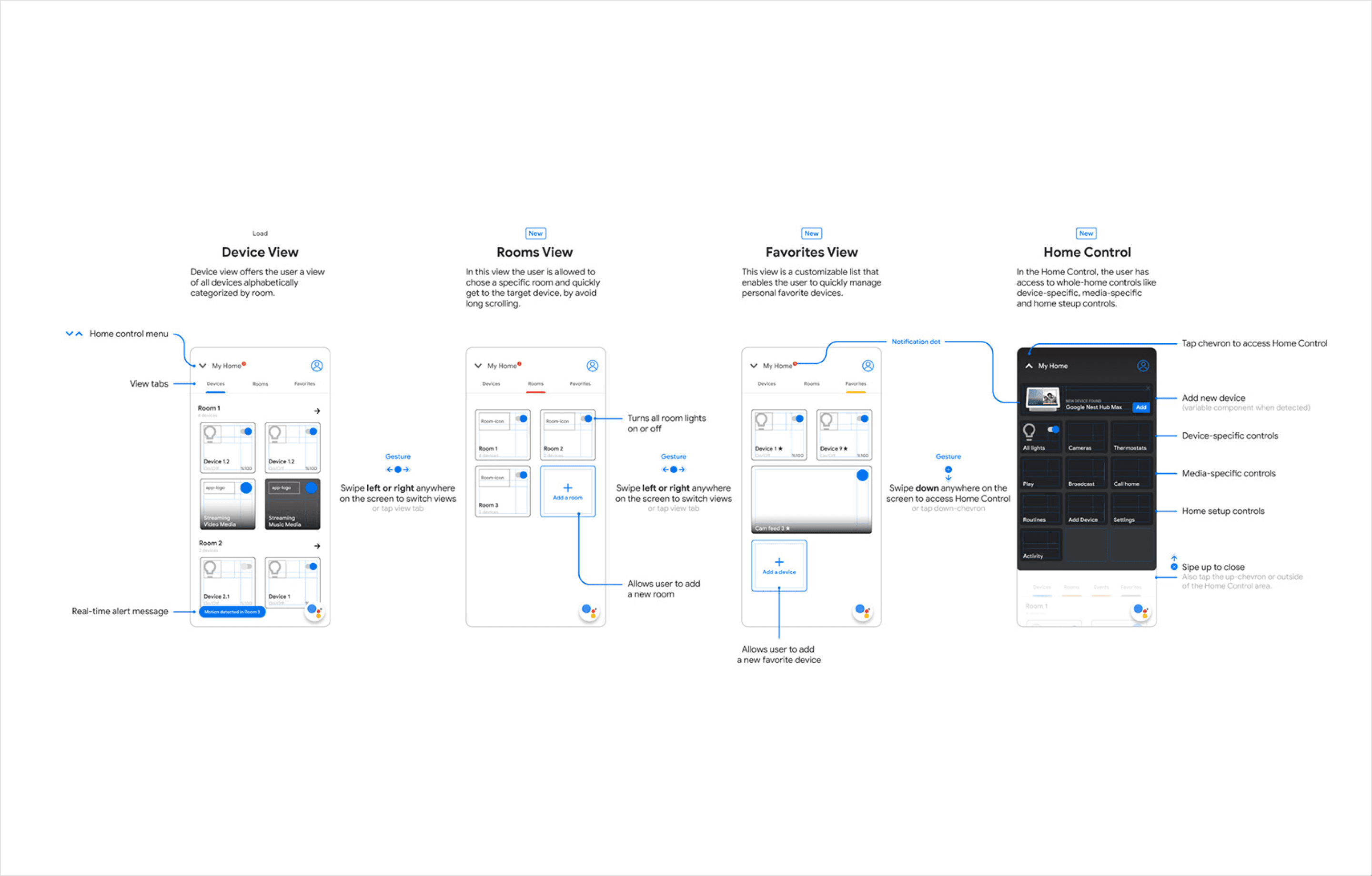
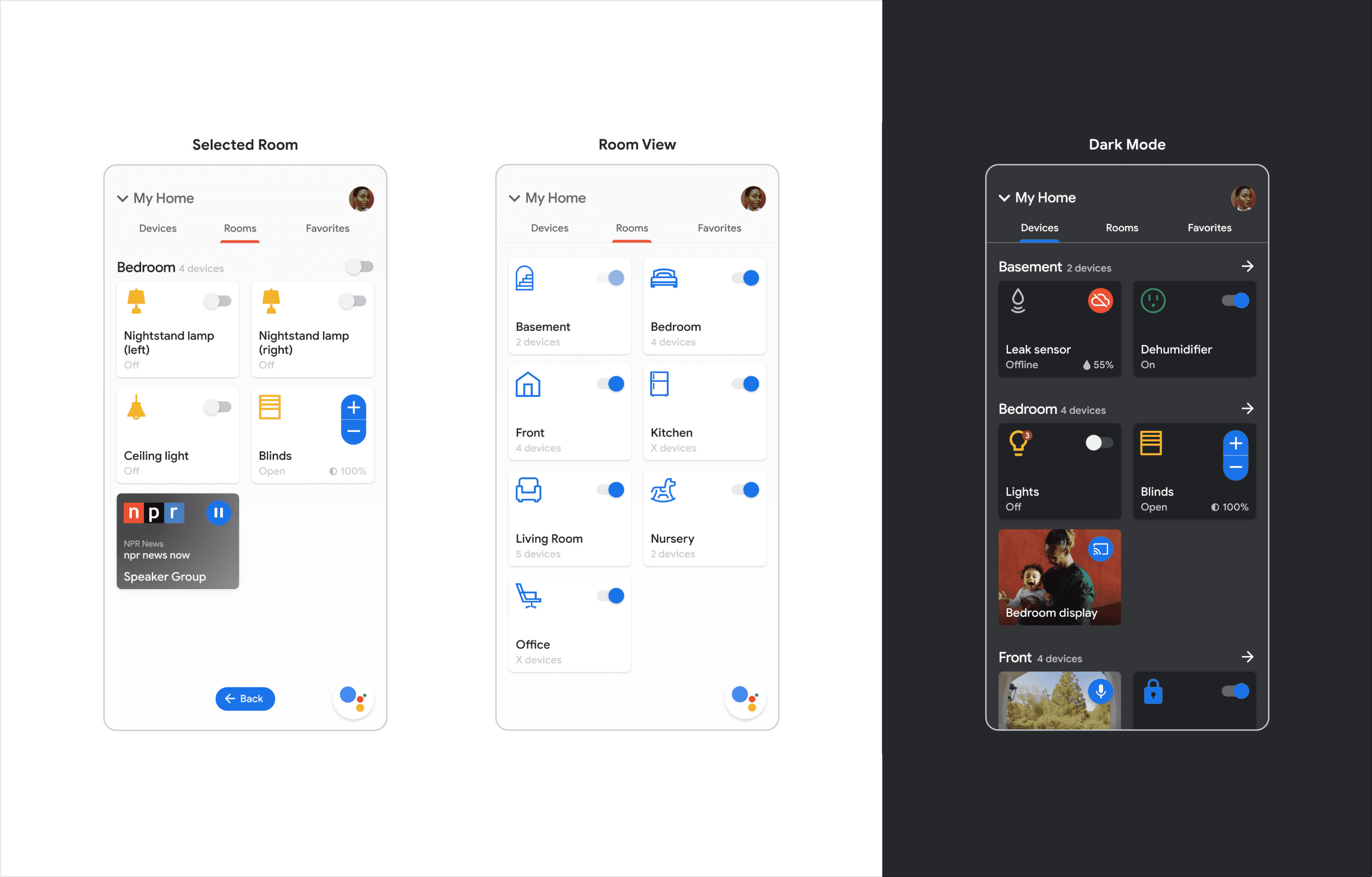
The redesign focused on creating a modular card-based layout, where each device was represented as an individual card. This replaced the traditional list view, making the interface more organized and visually distinct.
To improve navigation, I introduced tabs (Devices, Rooms, and Favorites) and sorting options, allowing users to switch between views or organize devices by type or location. A redesigned bottom navigation menu provided quick access to Google Assistant, Home, and recent activities, reducing the need for multiple interactions.
Branding and Visual Design
I updated the visual identity to align with Google’s own design system (pre-Material You), incorporating clean lines, simple typography, and a cohesive color palette. Personalized icons were designed for each device type to enhance recognizability, and a dark mode option was introduced for user comfort in low-light settings.
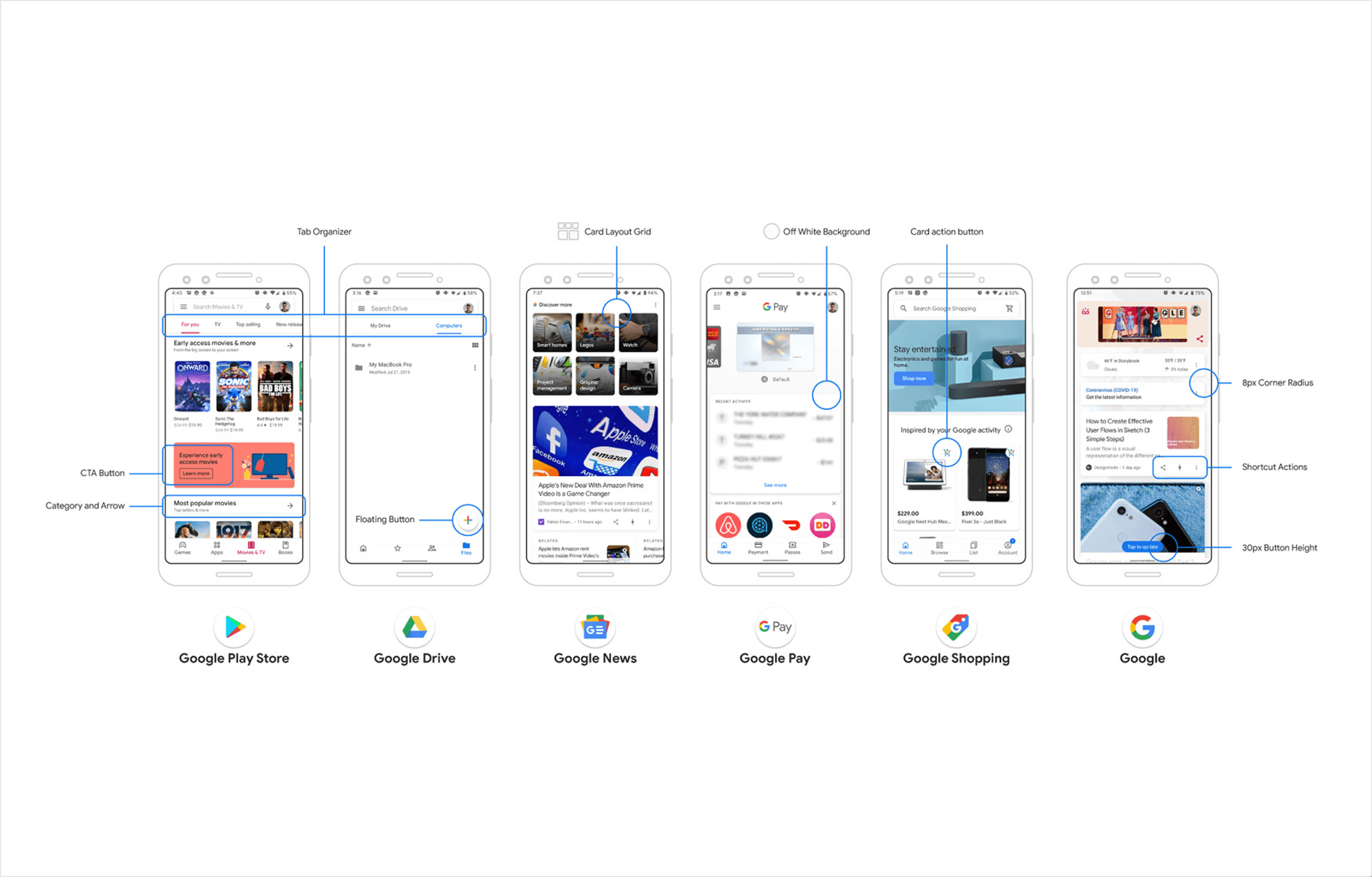
To establish a clear visual hierarchy, I structured the layout to prioritize key information, such as device status and controls, while relegating secondary features to menus. This approach reduced visual clutter and made the interface more intuitive to navigate.
Features and Functionality
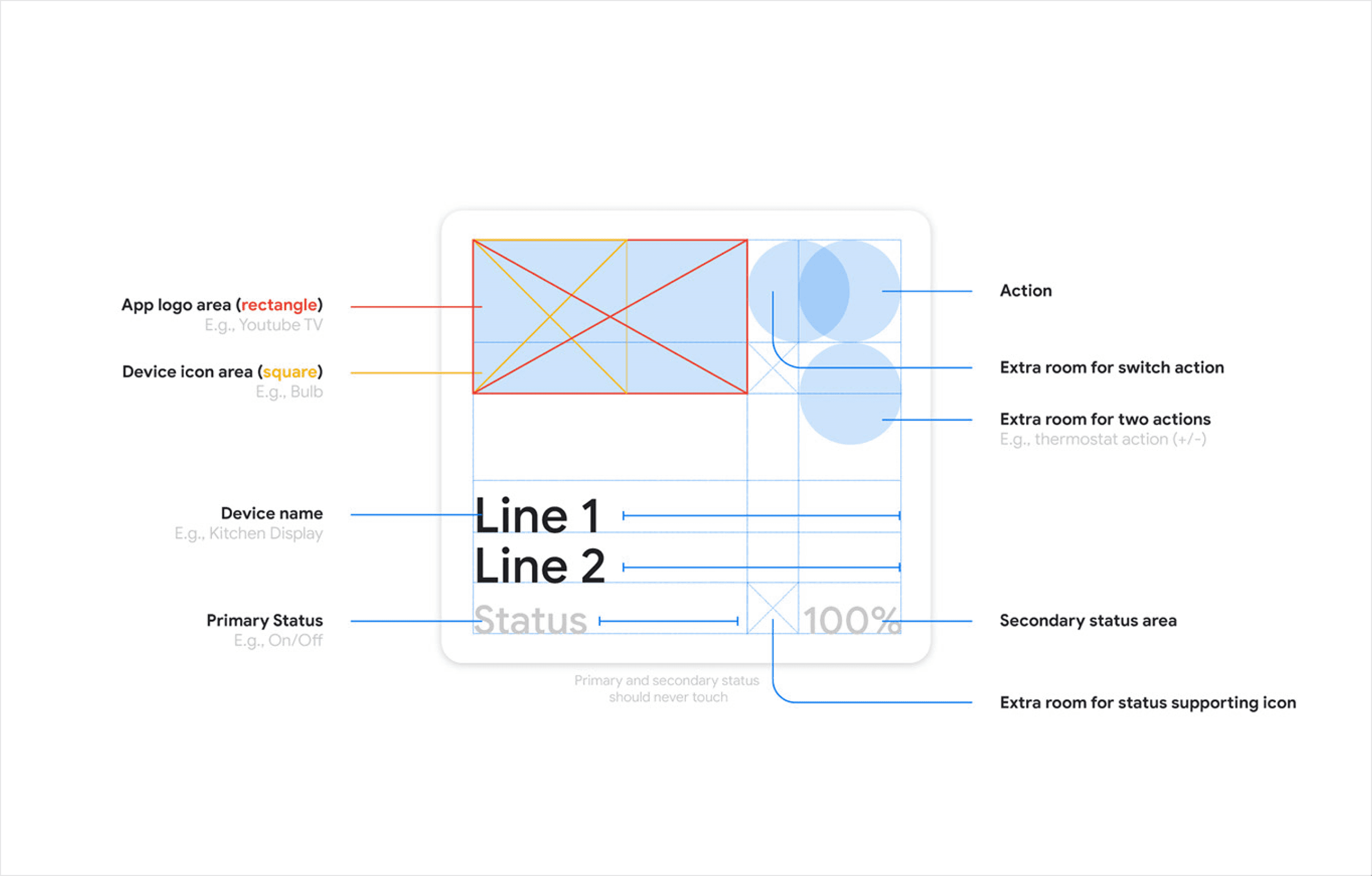
Modular Card-Based Layout
Replaced the traditional list view with a card system that grouped devices into visually distinct units, making it easier to locate and manage them.

Tab Organizer and Sorting
Added tabs (Devices, Rooms, and Favorites) for streamlined navigation, with sorting options for device type or location.
Enhanced Bottom Navigation
Redesigned the bottom menu for quick access to Google Assistant, Home, and recent activities.
Specific Icons and Dark Mode
At the time, the amount of icons on the app were limited and felt too generic, and almost abstract — this is not a diss on the icon designs. However, I believed the icons were too thin for the application. I pulled some icons together that in my view, better represented the diverse group of equipment that was compatible with the Google Home ecosystem.
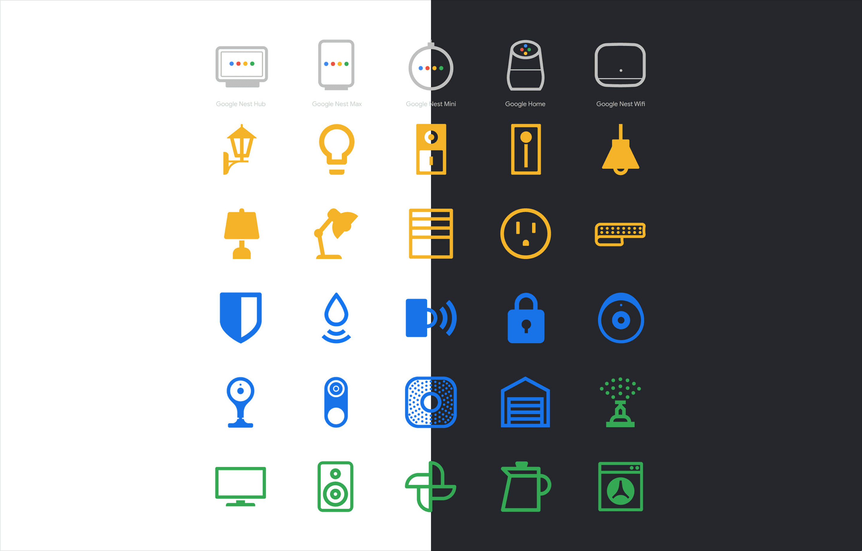
You could literally use the Google Home app as a flashlight in the dark, no joke. It was painful to interact with the app in a dark environment, particularly something that users check throughout the day. I introduced dark mode for improved accessibility and user comfort, along with personalized icons for each device type.
The color coding was an experiment to help categorize icons. Gray for the Google Home speakers, yellow for lights and plugs, blue for security devices, and green for everyday and third-party speakers.

Optimized Visual Hierarchy
Established a clear structure to reduce clutter and improve readability, and maximize screen real estate above fold.
Home Control Center
One of the biggest challenges with smart home apps is providing quick access to frequently used devices and controls. While the room-based flow offers precision for managing individual spaces, having primary global features easily accessible is equally important.
The Home Control Center solves this by being just a swipe away. It opens as a sheet or drawer, offering quick access to essential features like turning off all lights, viewing cameras, playing music, broadcasting messages, and more.
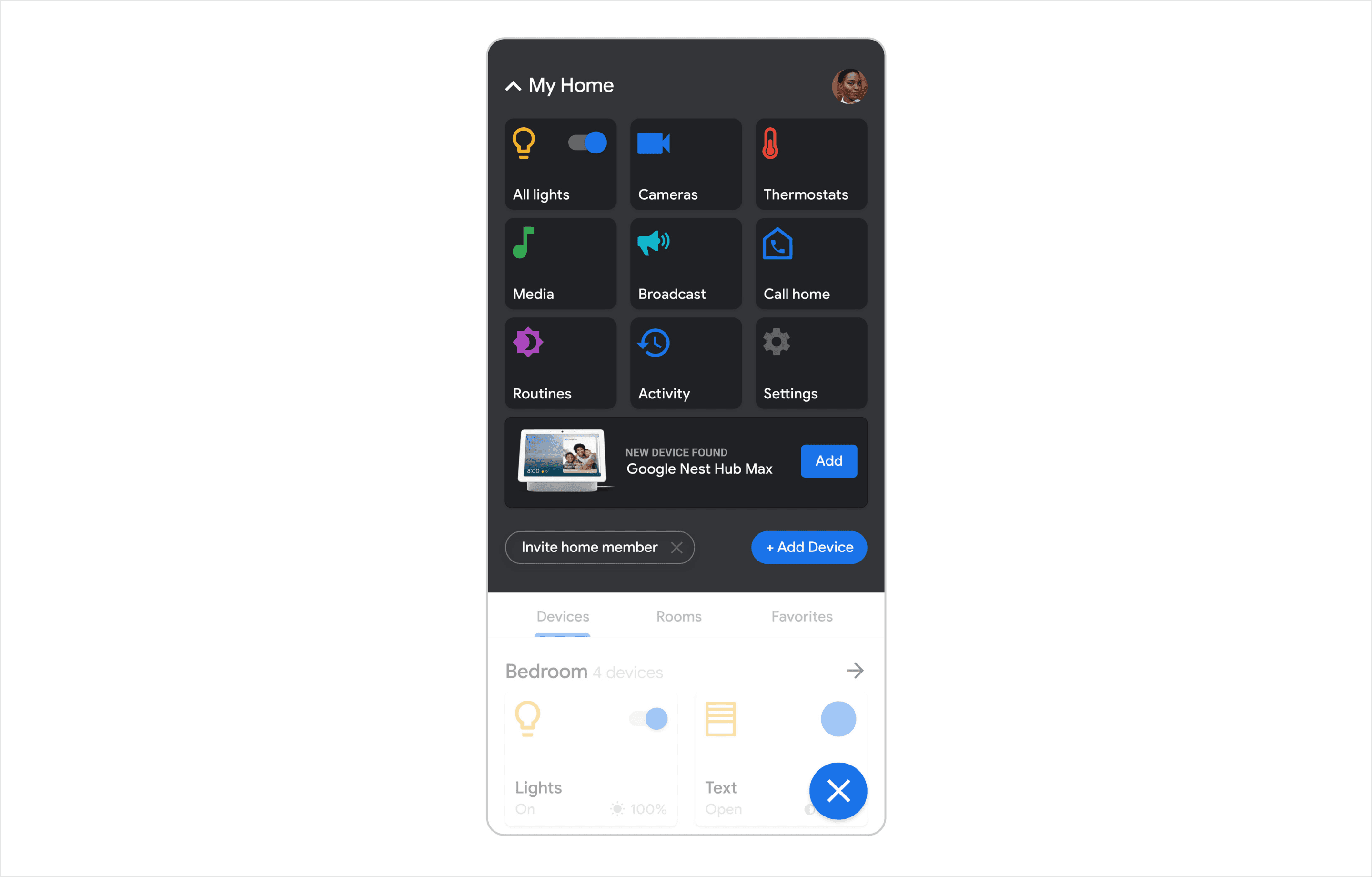
This space also supports new device onboarding, adding an engaging element by showcasing products with 3D animations that rotate and zoom in. This feature not only enhances functionality but also generates awareness about new equipment with a subtle marketing touch.
Wireframe
Systems
Next Steps
There aren't any next steps for this project, other than looking back and re-evaluate. If it was today (2024), I'd do a couple of things differently. This project sparked my passion for app design and problem-solving, motivating me to explore more opportunities to design for usability and accessibility. This exploration also solidified my interest in tackling complex design challenges and reaffirmed my commitment to creating thoughtful, user-centered solutions, in a team environment.
