Case Study
Clark EcoEnergy Website
Redesigning Clark EcoEnergy’s website to reflect their mission, showcase their work, and support their growth in renewable energy.
Before
After
Project Overview
Status
Shipped
Contribution
Lead Designer
Year
2024
Product
Web Design
Audience
Lead Product Designer
Skills
UX Design & Strategy
Product Strategy
User Research
Prototyping & Testing
Design System
Content Design
Problem Statement
Results & Impact
Goals
The primary goal was to redesign the website and to establish a bold and cohesive brand for Clark EcoEnergy, including a new logo and visual identity. The website needed to stand out among competitors with a modern and visually appealing design that showcased the company’s case studies through images and videos. Additional objectives included defining a clear voice and tone for the brand, ensuring the site was fully responsive, and creating a CMS that allowed the client to easily auto-generate content without requiring ongoing development efforts, saving time and money.
Discovery
Define
Design Process
Logo Design
I reimagined the existing logo into a stylized sun symbolizing renewable energy’s cyclical nature. Using green for eco-friendliness and yellow for solar energy, the design reinforced the company’s sustainability mission.
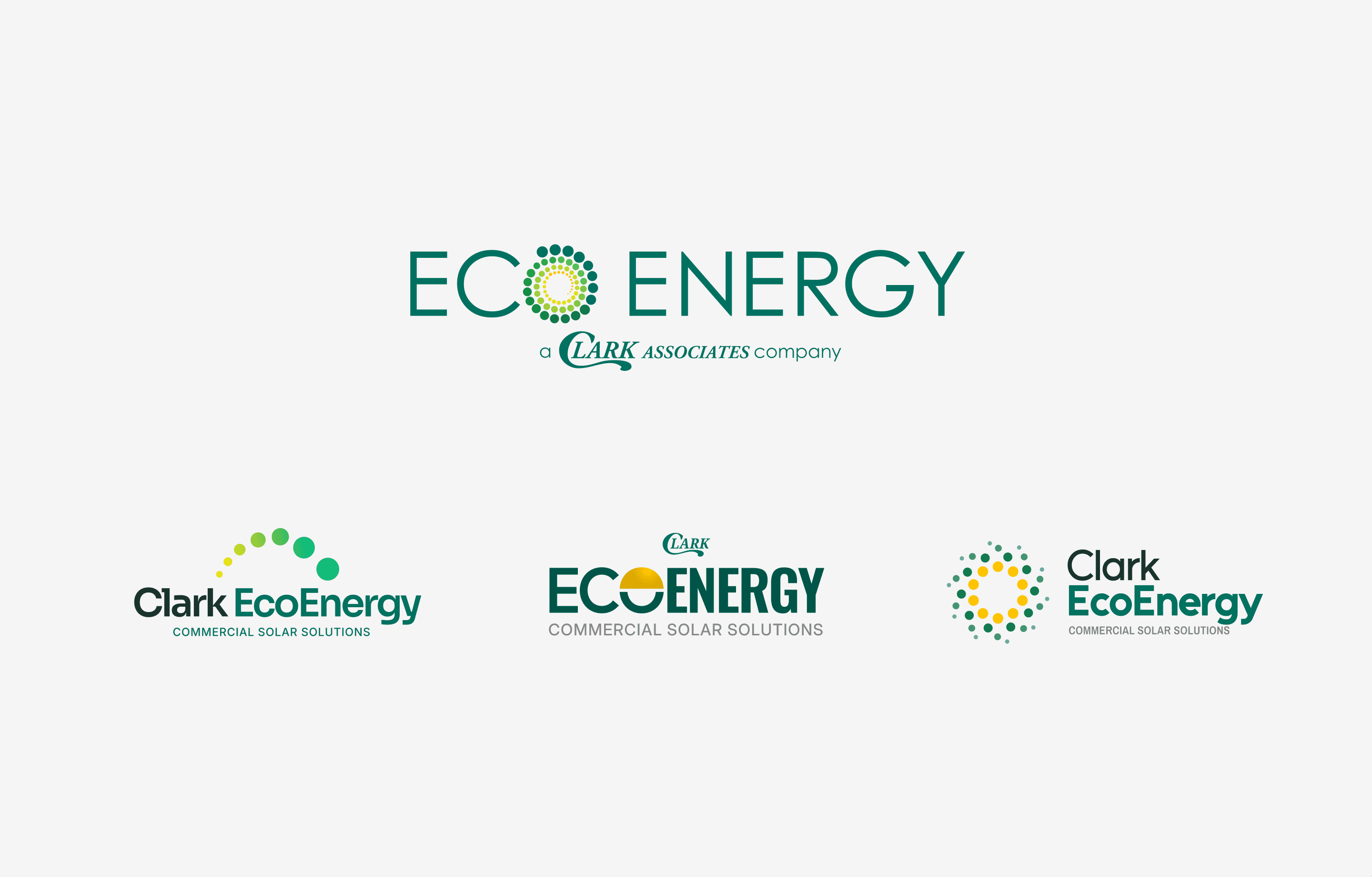
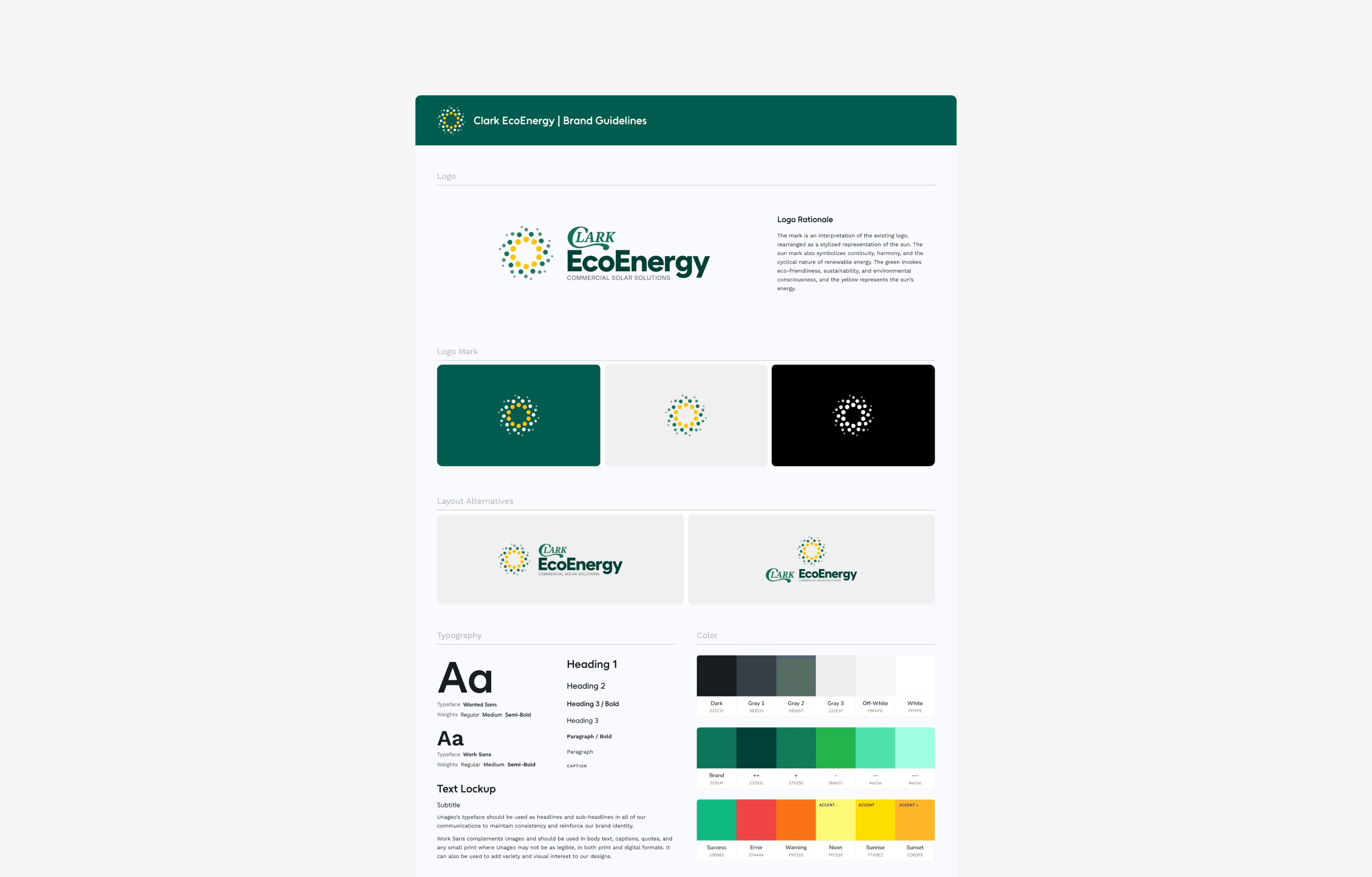
Brand Guidelines
I developed a comprehensive brand guideline document, including color palettes, typography, logo orientations, iconography, and photography direction. This created a cohesive identity for the company across all touchpoints.
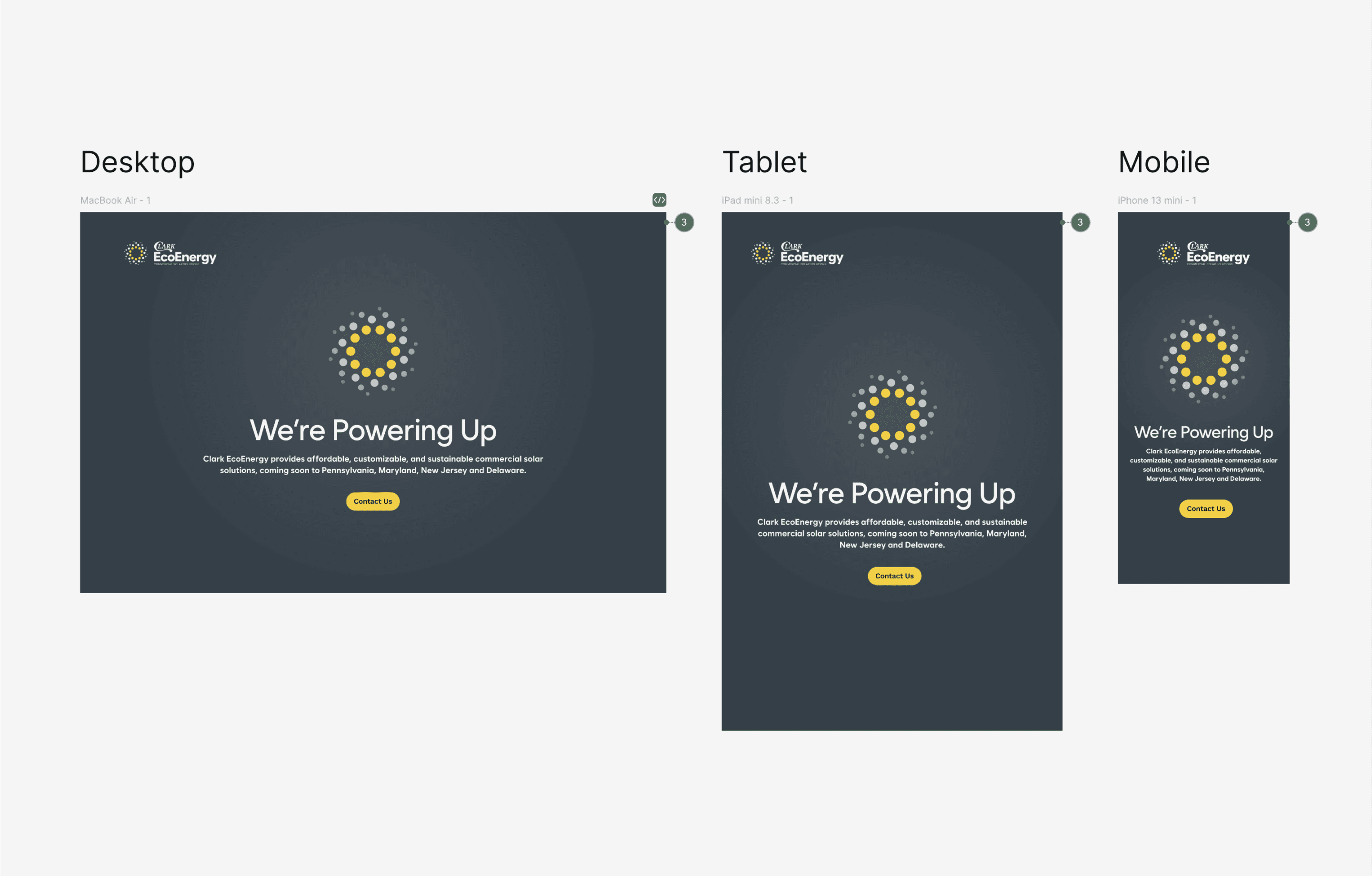
Landing Page
To support early development efforts, I designed a minimalistic splash page using the brand guidelines. This interim page helped establish an on-brand look while the final site was under development.
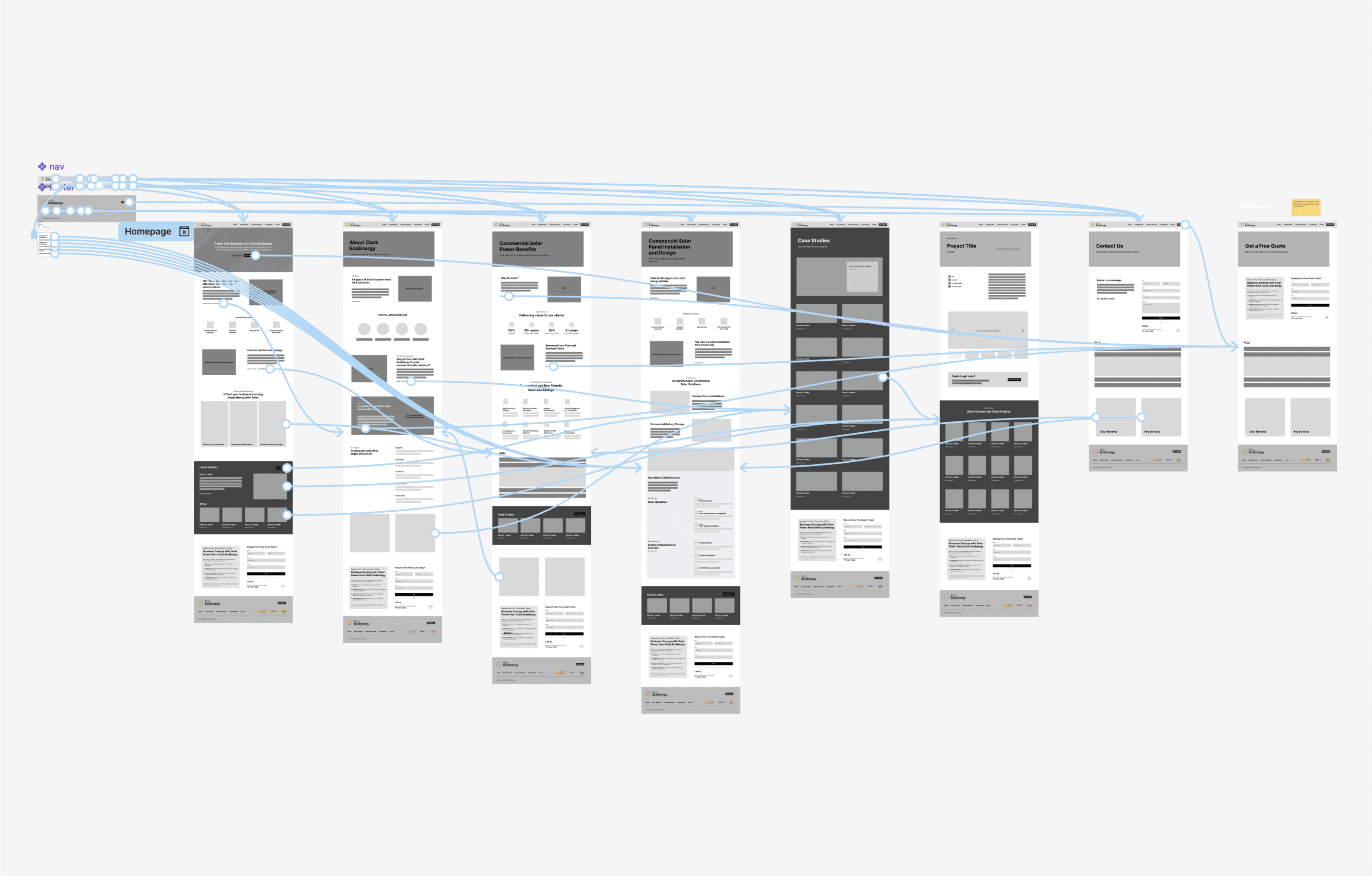
Low-Fidelity Designs
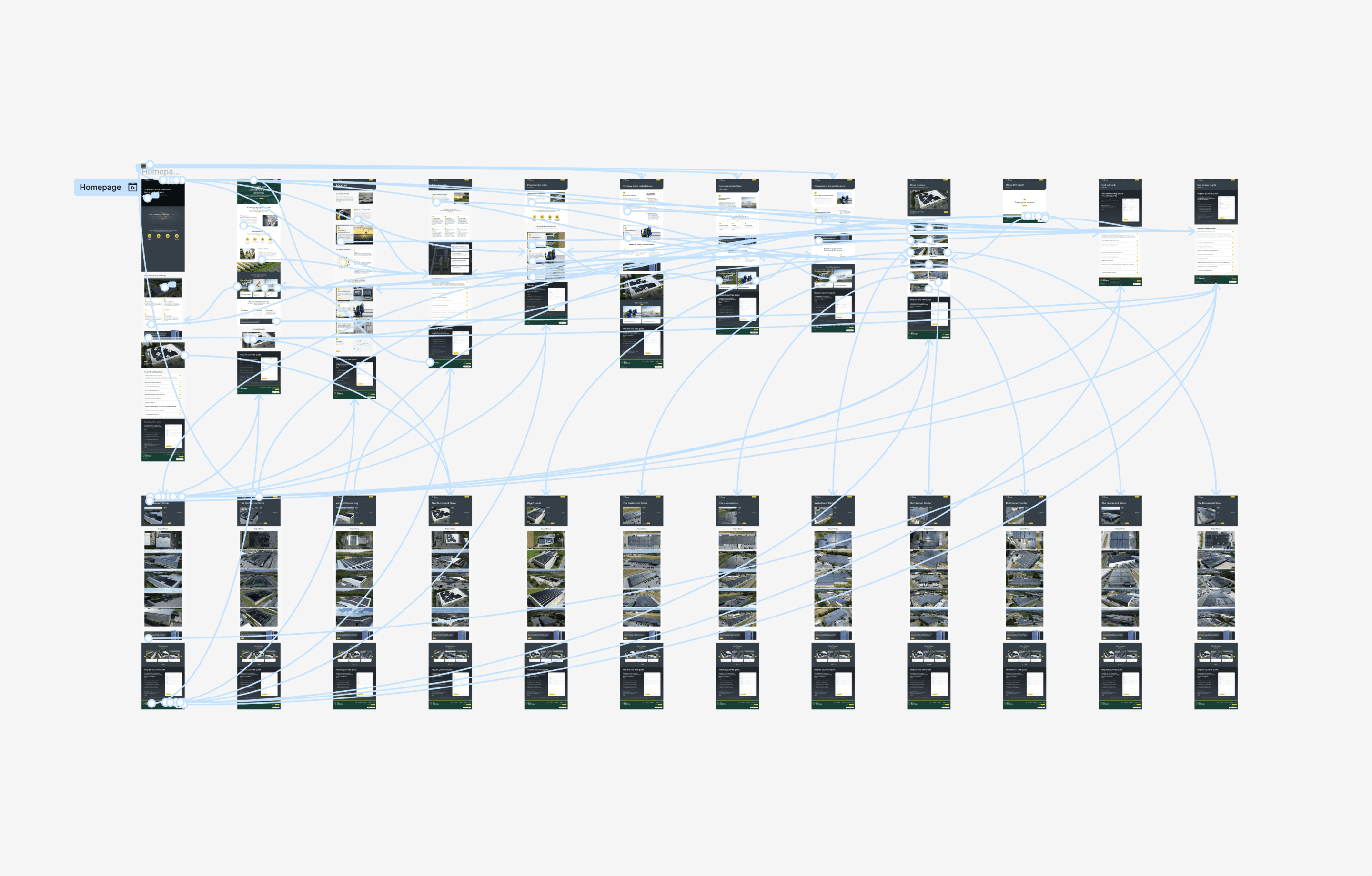
Using Figma, I created low-fidelity interactive prototypes to structure the site’s information architecture. Collaborating with stakeholders, I clarified content relationships and prioritized features, ensuring the design aligned with technical and business goals.
High-Fidelity Designs
After receiving approval on the low-fidelity designs, I began exploring high-fidelity concepts to bring the site to life. My initial approach focused on a simpler format with green accents to align with the brand’s identity. However, feedback from stakeholders indicated that the homepage lacked the bold, premium feel they wanted. Taking this feedback into account, I returned to the drawing board to create a more dynamic and visually engaging experience while considering technological constraints.
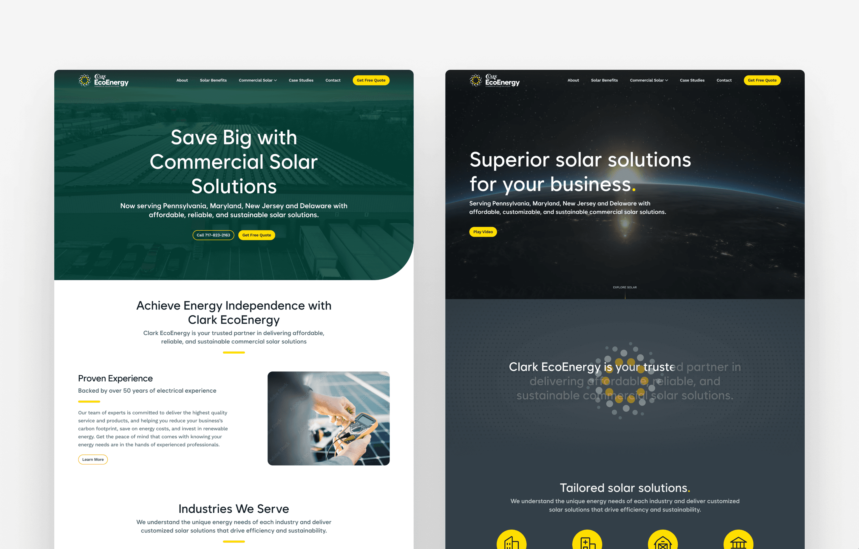
For the updated homepage, I introduced several enhancements to deliver the desired "wow" factor. These included:
A prominent hero section with video to immediately capture attention.
Micro-animations that activate on scroll to create a polished, interactive feel.
Sticky modules that enhance usability while maintaining user focus.
Refined use of patterns and textures to establish a more premium look and feel.
In addition to the homepage, I designed case study templates tailored for seamless integration with the CMS. These templates were structured to allow easy data entry and automatic population into the site, including the generation of URLs. This ensured efficiency and consistency across the platform.
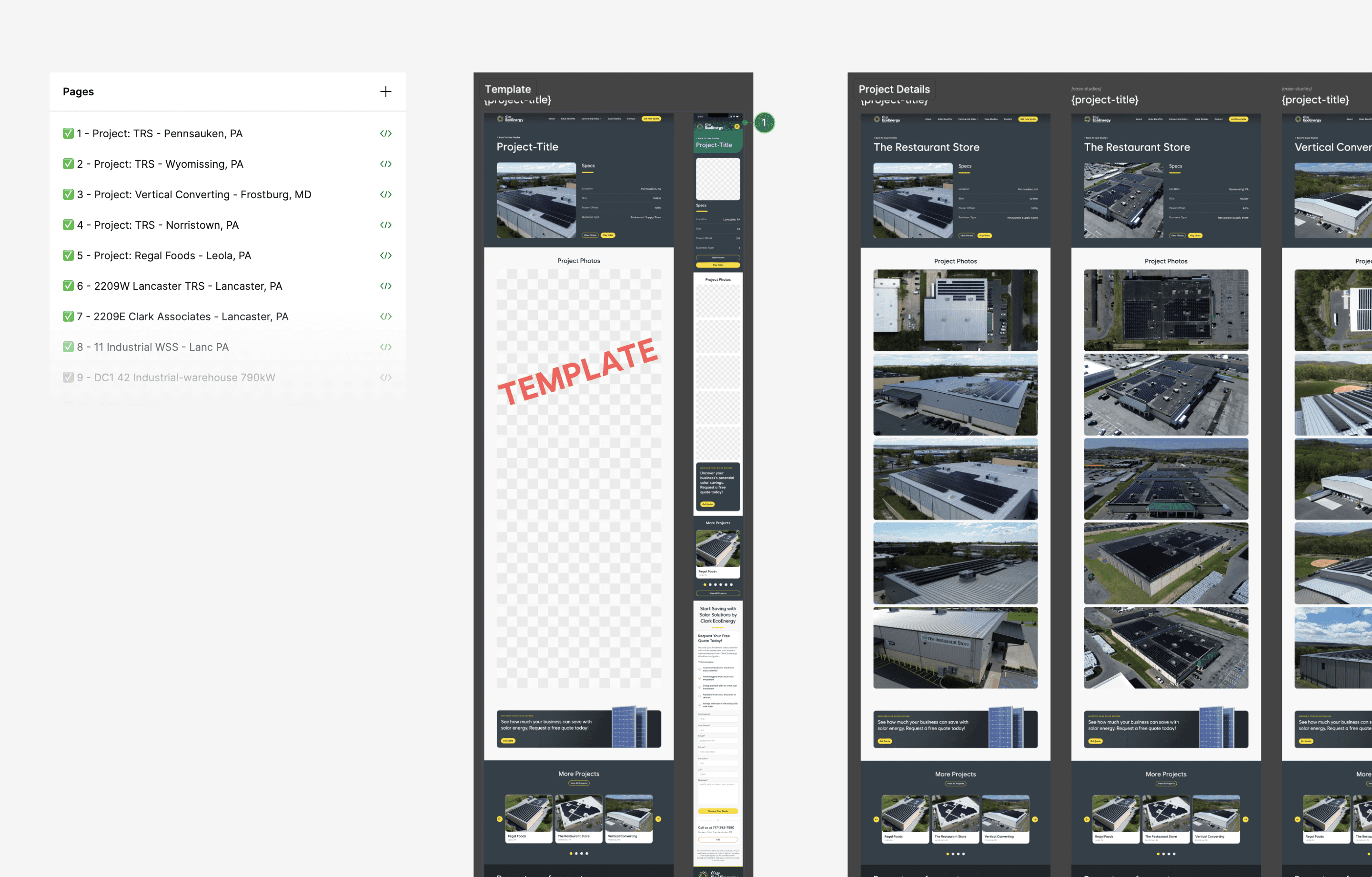
Given that the existing site was built on static HTML tables and lacked responsiveness, the new designs were crafted to accommodate mobile viewports. This step ensured the site would provide a modern, user-friendly experience on all devices.
To help the client visualize the new experience before committing to development, I created a high-fidelity interactive prototype. This prototype allowed stakeholders to interact with the site and provide feedback on the design. After just one iteration, the design was approved for development.
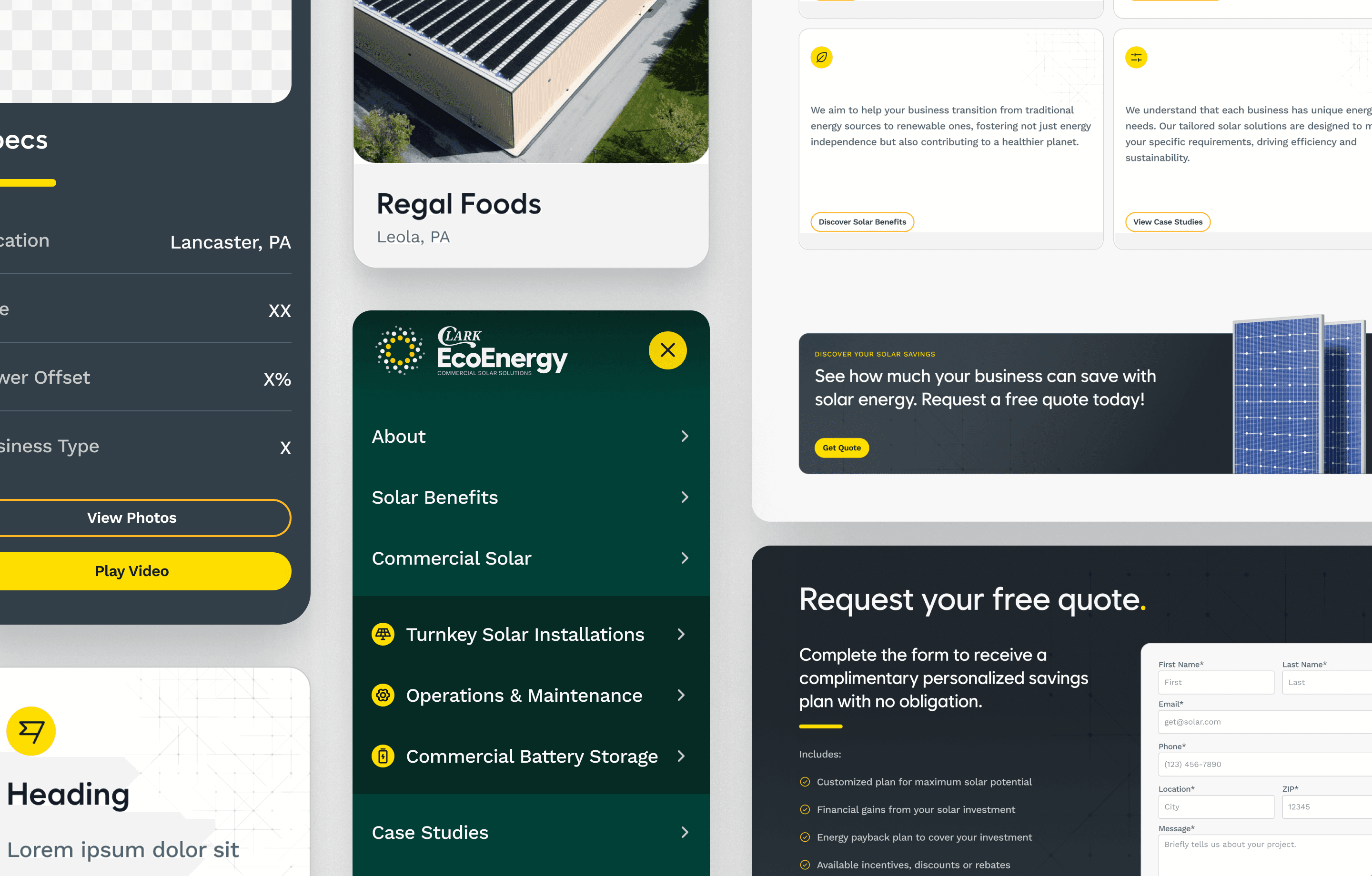
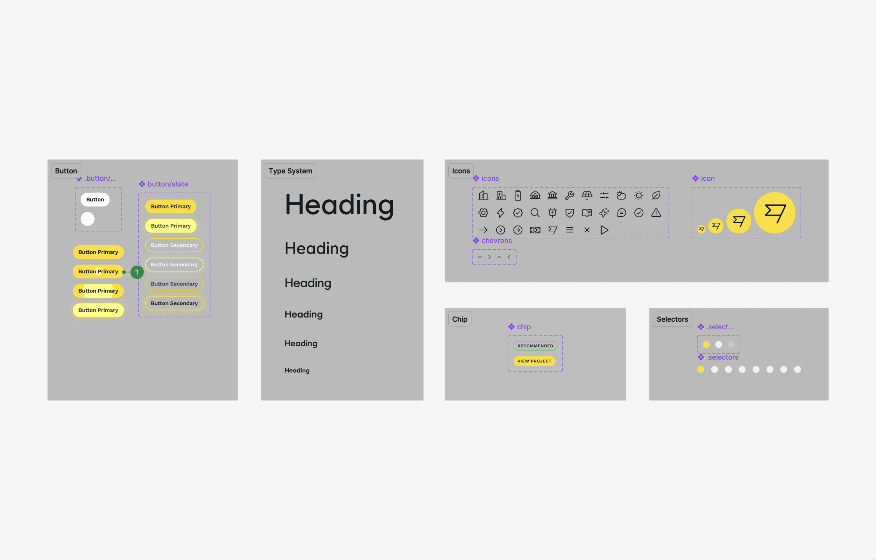
Components
To streamline development and maintain consistency across the design system, I expanded upon the brand guidelines and created modular components in Figma. This approach ensured that key design elements could be easily reused and updated across multiple pages and frames, reducing the risk of discrepancies.
Building components is one of my preferred methods for tackling these challenges, as it enables scalability and efficiency throughout the design process. Changes made to a single component propagate automatically across all instances, allowing for quick iterations and alignment with evolving requirements. This approach not only saved time during the design phase but also supported a smoother handoff to developers by providing clear, reusable design assets.
Video Creation
I scripted the video’s core concept and enhanced it using AI tools like ChatGPT for persona modeling. Collaborating with the video team, I art-directed graphics, transitions, and voiceovers to align with the brand’s tone.
Setting Up Details
To expand Clark EcoEnergy’s digital presence, I set up a Google Business Profile and a YouTube channel. The YouTube channel was integral to the case study CMS, allowing clients to upload drone footage and embed videos directly. Also prepared the open graph image, favicon, and worked with SEO to write metadata for the site.
Development Collaboration
I worked closely with the full-stack developer to ensure accurate implementation of animations, micro-interactions, and responsiveness. Together, we streamlined the CMS to allow the client to add new case studies by uploading videos, images, and project details, which would automatically populate the gallery and project pages.
Wireframe
Systems
Next Steps
Moving forward, the site will be monitored for user behavior to gather insights and identify areas for further optimization. Efforts will also focus on ensuring the CMS remains functional and intuitive, allowing the client to maintain and expand their case study gallery effortlessly as new projects are completed.